KAUS: Insurance for the People
Case Study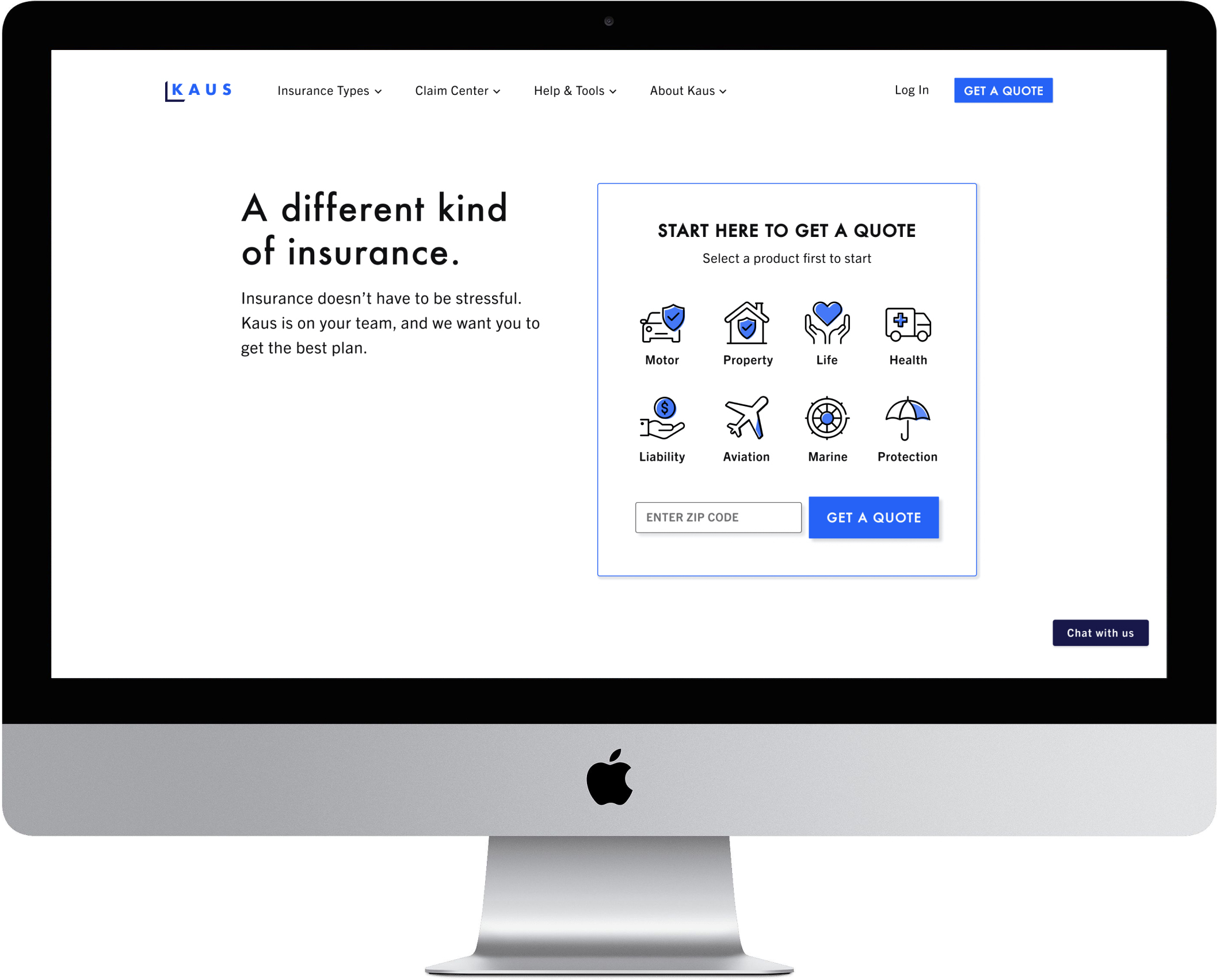
PROJECT OVERVIEW
The Challenge: KAUS is a large and established company that sells insurance B2B (business to business), but they’ve been losing ground with the rise of the internet and personal devices. They want to tap into the younger, digital market with a responsive e-commerce website as well as a fresh, modern logo.
The Solution: A responsive website with hover-activated definitions for insurance terminology and an updated logo evoking modernity and trustworthiness.
Click here to access the high fidelity prototype.
Role: Sole designer
Mentor: Alan Hurt Jr.
Time: 4 weeks
Tools: Figma, OptimalSort, InVision, Adobe Illustrator
Mentor: Alan Hurt Jr.
Time: 4 weeks
Tools: Figma, OptimalSort, InVision, Adobe Illustrator
STARTING WITH EMPATHY
In order to create the best product for KAUS and their potential customers, I needed to understand: 1) who is our user and 2) what are their needs? Thus, I began this process with research. I created a research plan to learn more about the insurance industry, our competitors as well the potential audience. It was also crucial to write out all my assumptions to test these hypotheses and create awareness of any preconceived notions I might have that would affect the research process.
LET’S GET DOWN TO RESEARCH
Research Goals:
Assumptions:
Methodologies:
1. Secondary research:
Research Goals:
- Identify who the customer is
- Identify the cognitive biases, fears, and confusion that potential customers have around selecting insurance
- Empathize with the potential customer in order to build the best possible user experience
Assumptions:
- Young customers need more information and education when purchasing insurance
- The target users is 21-25 years old
- A well-designed interface positively influences a young customer’s perspective of the insurance company
- People have confusion around and are intimidated by insurance
Methodologies:
1. Secondary research:
- Market research - Looking at existing research to understand the trends inthe insurance industry
- Competitive analysis - Gathering data about other insurance competitors, especially their strengths and weaknesses
- Customer interviews - Conducting remote interviews with participants to understand their thoughts around insurance and gain insights
Competitive Analysis

I’M LISTENING
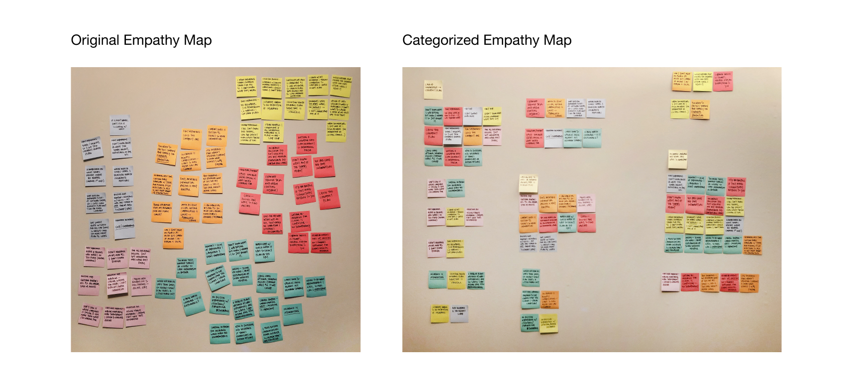
These interviews were crucial in the research process as I gained insight on who the user is and their needs by creating an empathy map from interview observations. Some assumptions were validated and some were not, which helped provide a more focused direction for possible solutions.
- 3 females, 3 males
- Ages 26-62
- Average time duration: 16 minutes
These interviews were crucial in the research process as I gained insight on who the user is and their needs by creating an empathy map from interview observations. Some assumptions were validated and some were not, which helped provide a more focused direction for possible solutions.
Empathy Map
Each post-it color represents an interview participant, and the image on the right displays clusters that were formed by the similar patterns found in my observations of our conversations. From those clusters, I was able to form insights about the users, and then I extrapolated the needs from those insights.
Insights:
- Saving cost is the most influential factor for car insurance
- Ease of online access to insurance positively influences user
- Users are insecure when they don’t understand insurance terminology
- Lack of transparency causes distrust from user
Needs:
- To get the best deal
- To not waste time
- To feel confident in their insurance selection
- To understand what they’re paying for
AMIRIGHT? OR AMIRIGHT? Which of my assumptions were proven correct or incorrect?
- Young customers need more information and education when purchasing insurance ︎
- The target user is 21-25 years old ︎
- A well-designed interface positively influences a young customer’s perspective of the insurance company ︎
- People have confusion around and are intimidated by insurance ︎
DEFINING THE USER & THE PROBLEM
Going Deeper into the insights and data from customer interviews:
- 4/6 participants had more than one experierence in selecting and purchasing insurance, but outside of the process they did not make a concentrated effort to learn the terminology (out of the remainging two, one of the participants worked in insurance for over 30 years and the other was involved with flipping properties)
︎︎︎So? Not only do our participants want to avoid wasting time, but also think finding education outside of the insurance selection process is not a worthy use of their time.
- 5/6 interview participants (ages 26-32) surprisingly need a lot of help even after mutiple experiences with insurance. They still felt frustrated and intimidated by insurance, but also felt they were at a point in their lives where they should know more.
︎︎︎So? My assumption that the target user would be young, most likely a college graduate or in that age range, was proven wrong. Users who have been in the workforce for longer and have more frequent interactions with insurance would benefit much more from a product that is centered around their needs.
The synthesized findings from the empathy map helped me to create a persona, which is the user that I will refer to when making future decisions.
Persona
The empathy map was also the source of finding out the user’s goals, needs, frustrations and motivations. Other parts of her persona (age, occupation, bio) were a composite of the users I interviewed and the similarities among them.
The empathy map was also the source of finding out the user’s goals, needs, frustrations and motivations. Other parts of her persona (age, occupation, bio) were a composite of the users I interviewed and the similarities among them.
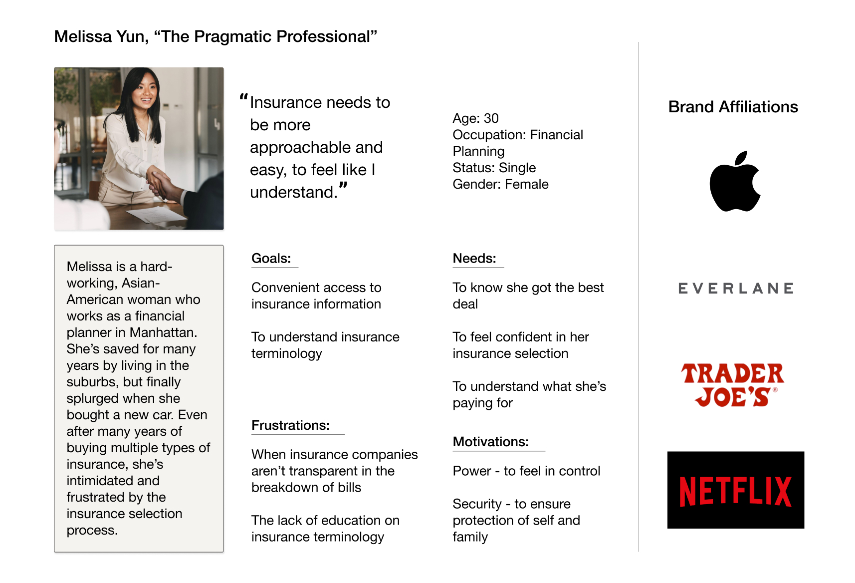
“Insurance needs to be more approachable and easy, to feel like I understand.”
The data has shown me that understanding is the bridge that is missing for our user and causes her to become intimidated and frustrated about insurance due to feeling a lack of control. Looking at the needs and insights that seem most urgent for our user, the problem I will focus on is:
PROBLEM: Melissa needs to feel confident about her insurance selection, but cannot do so without understanding the insurance terminology.
I know the user, I have the problem I want to focus on – let’s design the solution!
PROBLEM: Melissa needs to feel confident about her insurance selection, but cannot do so without understanding the insurance terminology.
I know the user, I have the problem I want to focus on – let’s design the solution!
LAYING DOWN THE STRUCTURE
Before diving into brainstorm and design mode, I conducted a card sorting exercise to see how participants would categorize different pages and elements one would typically find on an insurance website. This would help me to understand how people think and categorize to create a navigation that makes sense for our user.
The card sorting results revealed that participants had no trouble categorizing:
However, they did have trouble categorizing the following:
The data showed me that participants had fairly good knowledge of pages that were clearly established on other insurance competitors’ websites. However, the cards they had trouble sorting were tools that were created to directly help the user. I concluded that: 1) participants did not have much experience with using such tools and 2) that I’d need these tools to be prominent on the homepage to make sure that users received very visible exposure to them.
Before diving into brainstorm and design mode, I conducted a card sorting exercise to see how participants would categorize different pages and elements one would typically find on an insurance website. This would help me to understand how people think and categorize to create a navigation that makes sense for our user.
The card sorting results revealed that participants had no trouble categorizing:
- Different insurance types (life, marine, motor, liability, etc.)
- Anything involving “My Account”
- Anything involving “About” (as in, about KAUS)
However, they did have trouble categorizing the following:
- Insurance Dictionary
- Comparison Tool
-
Coverage Calculator
The data showed me that participants had fairly good knowledge of pages that were clearly established on other insurance competitors’ websites. However, the cards they had trouble sorting were tools that were created to directly help the user. I concluded that: 1) participants did not have much experience with using such tools and 2) that I’d need these tools to be prominent on the homepage to make sure that users received very visible exposure to them.
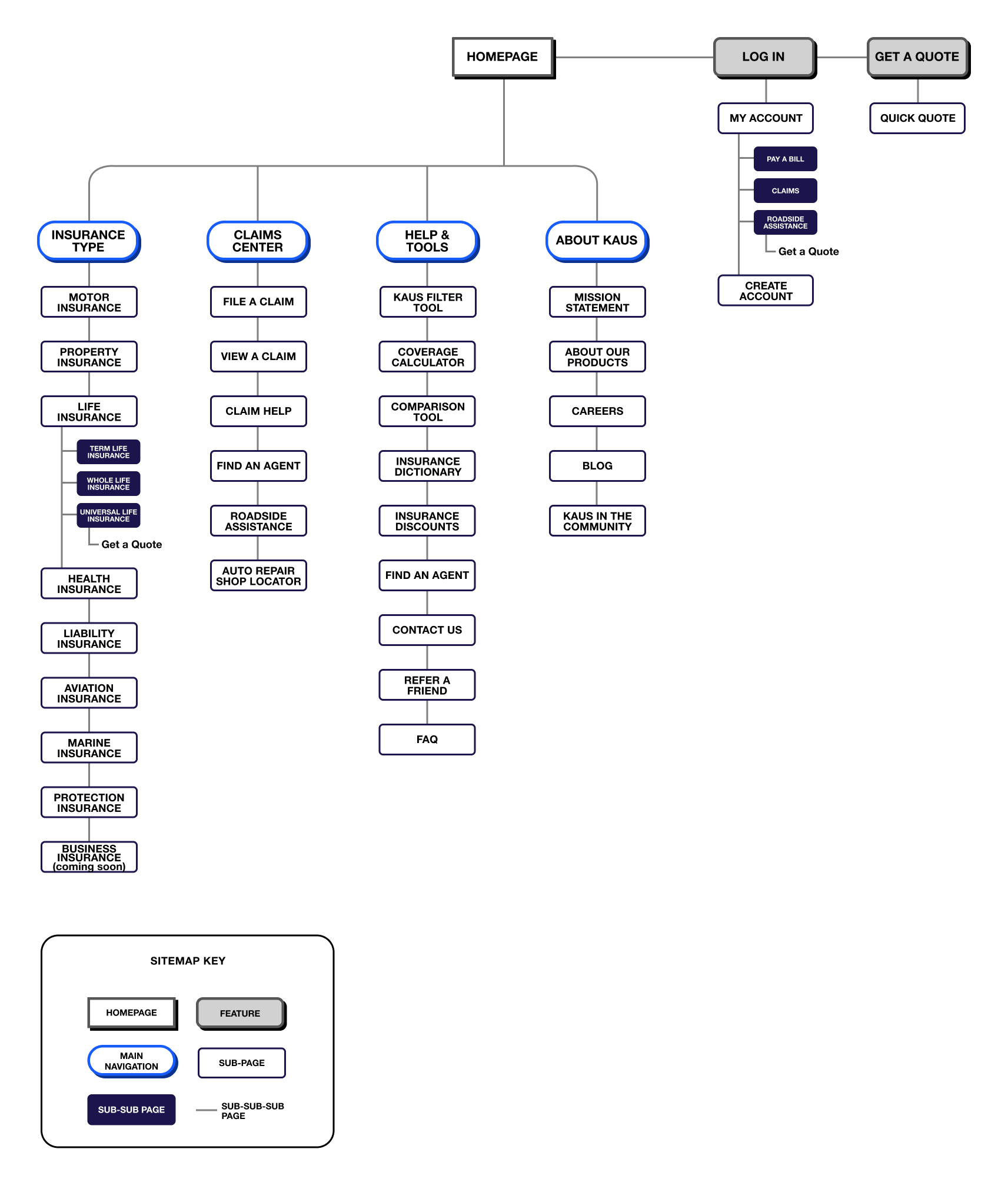
Sitemap
The results of the card sort were not as crucial to the sitemap as they were to the organization of the homepage, but it was helpful nonetheless.
The results of the card sort were not as crucial to the sitemap as they were to the organization of the homepage, but it was helpful nonetheless.
IDEATE AWAY
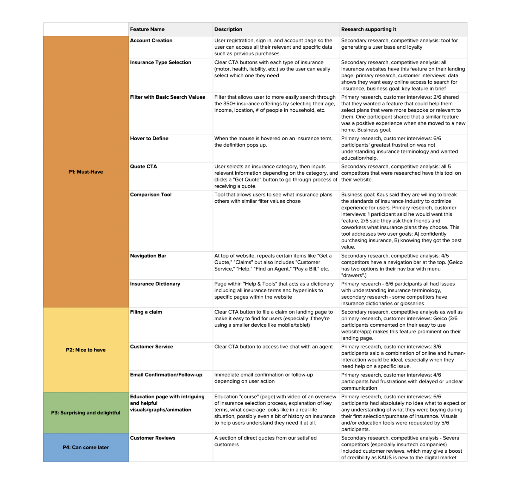
Now that I have the sitemap for the KAUS website, I spent some time brainstorming the detailed requirements and prioritization and compiled them into a feature roadmap. Taking into consideration that KAUS wanted to feature a filter tool to help users navigate their 350+ offerings easily, that the user’s greatest need is to understand terminology, and to make sure we are keeping in step with the standard of competitors’ websites, I made sure to prioritize and/or include those features. This is the initial working list.
Feature Roadmap
LET IT FLOW
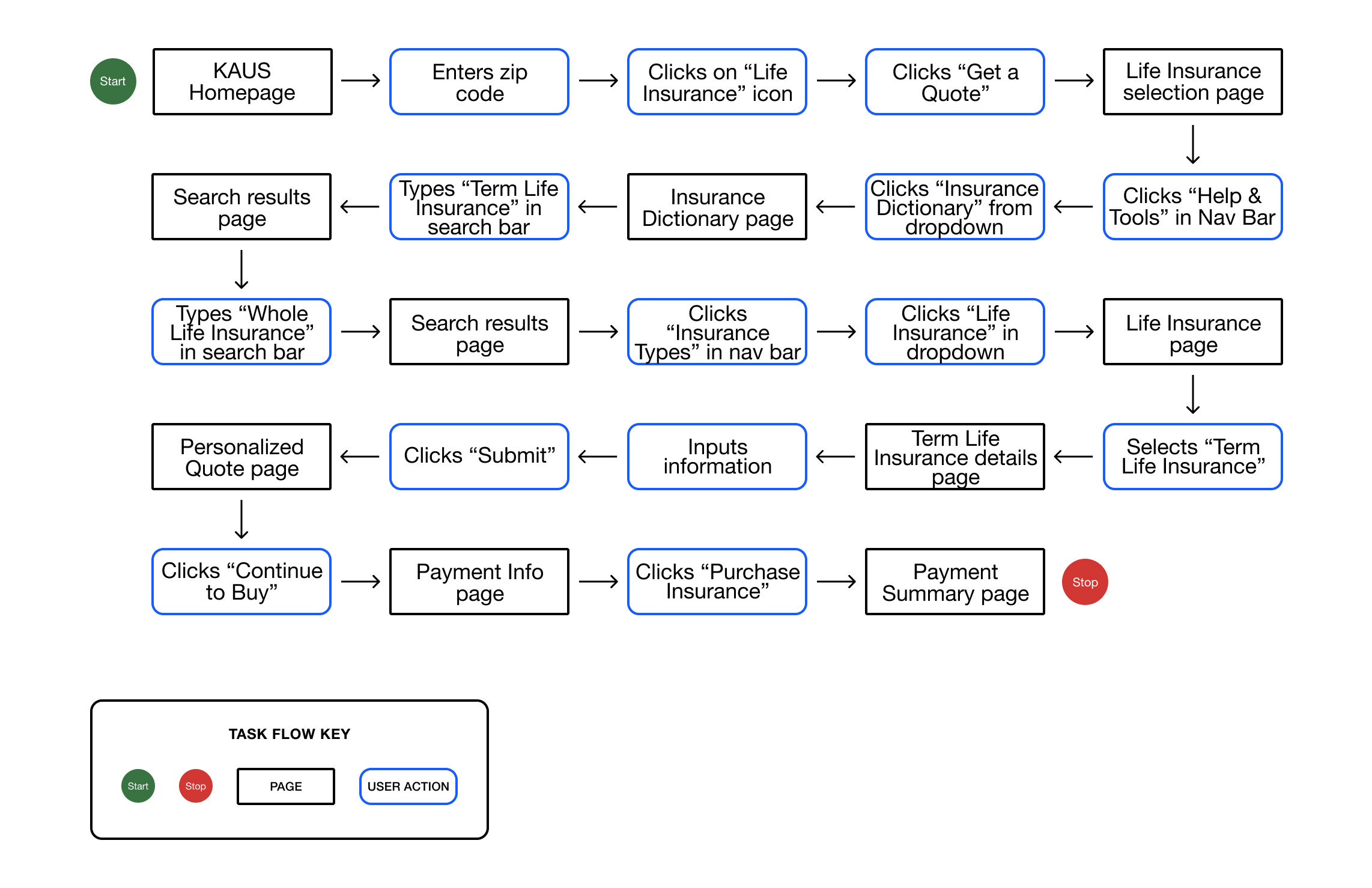
After having established the sitemap and a feature roadmap, I wanted to further investigate how our user would navigate through tasks on the KAUS website. One of KAUS’ business goals was to create a website that the user could easily navigate through with a pleasant experience. I would like to create a product that fulfills this objective and will use the task and user flows to do so.
After having established the sitemap and a feature roadmap, I wanted to further investigate how our user would navigate through tasks on the KAUS website. One of KAUS’ business goals was to create a website that the user could easily navigate through with a pleasant experience. I would like to create a product that fulfills this objective and will use the task and user flows to do so.
Task Flow Chart
LET’S GET VISUAL
The task and user flows helped me to determine what pages I would need to design for a prototype. I then created a UI Requirements list detailing what I would need to design for each page and made sure to include design patterns that were consistent on our competitors’ websites.
The task and user flows helped me to determine what pages I would need to design for a prototype. I then created a UI Requirements list detailing what I would need to design for each page and made sure to include design patterns that were consistent on our competitors’ websites.
Wireframe Sketches (Homepage)
I was initially leaning towards the last wireframe on the far right, but this, as you will see, changed with time.
I was initially leaning towards the last wireframe on the far right, but this, as you will see, changed with time.

Mid-Fidelity Wireframes
(Left to right: Motor Insurance Quote, Payment Page, Summary/Confirmation Page)
(Left to right: Motor Insurance Quote, Payment Page, Summary/Confirmation Page)

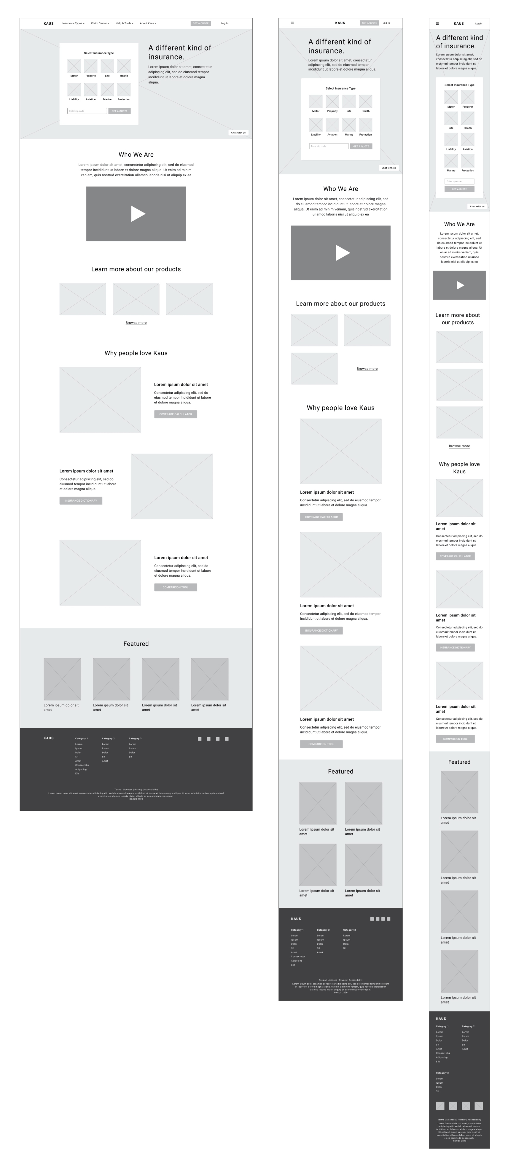
Responsive Mid-Fidelity Wireframes for Homepage
(Left to right: Desktop, Tablet, Mobile)
(Left to right: Desktop, Tablet, Mobile)
FINDING THE KAUS VOICE
I was quite excited to get into this part of the design process, and I started with the logo as this would be the real kickoff, in a sense, to creating the visual voice for KAUS. The brand attributes are as follows:
I was quite excited to get into this part of the design process, and I started with the logo as this would be the real kickoff, in a sense, to creating the visual voice for KAUS. The brand attributes are as follows:
- Trustworthy
-
Approachable
- Modern
- Fresh
- Clear
Logo Sketches & Process

Final Logo
Initially I had landed on the first version. However, upon speaking with my mentor and placing it into my high fidelity wireframes, we realized that it looked more like a button. To avoid confusion for users, I edited the logo to the final version you see below.

Style Tile

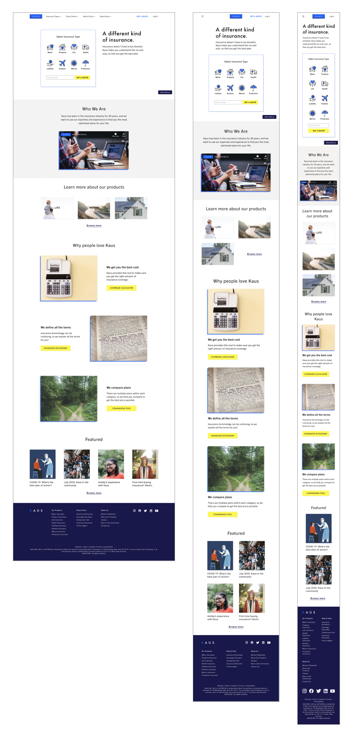
Responsive UI Designs
(Left to right: Desktop, Tablet, Mobile)
(Left to right: Desktop, Tablet, Mobile)
PROTOTYPE
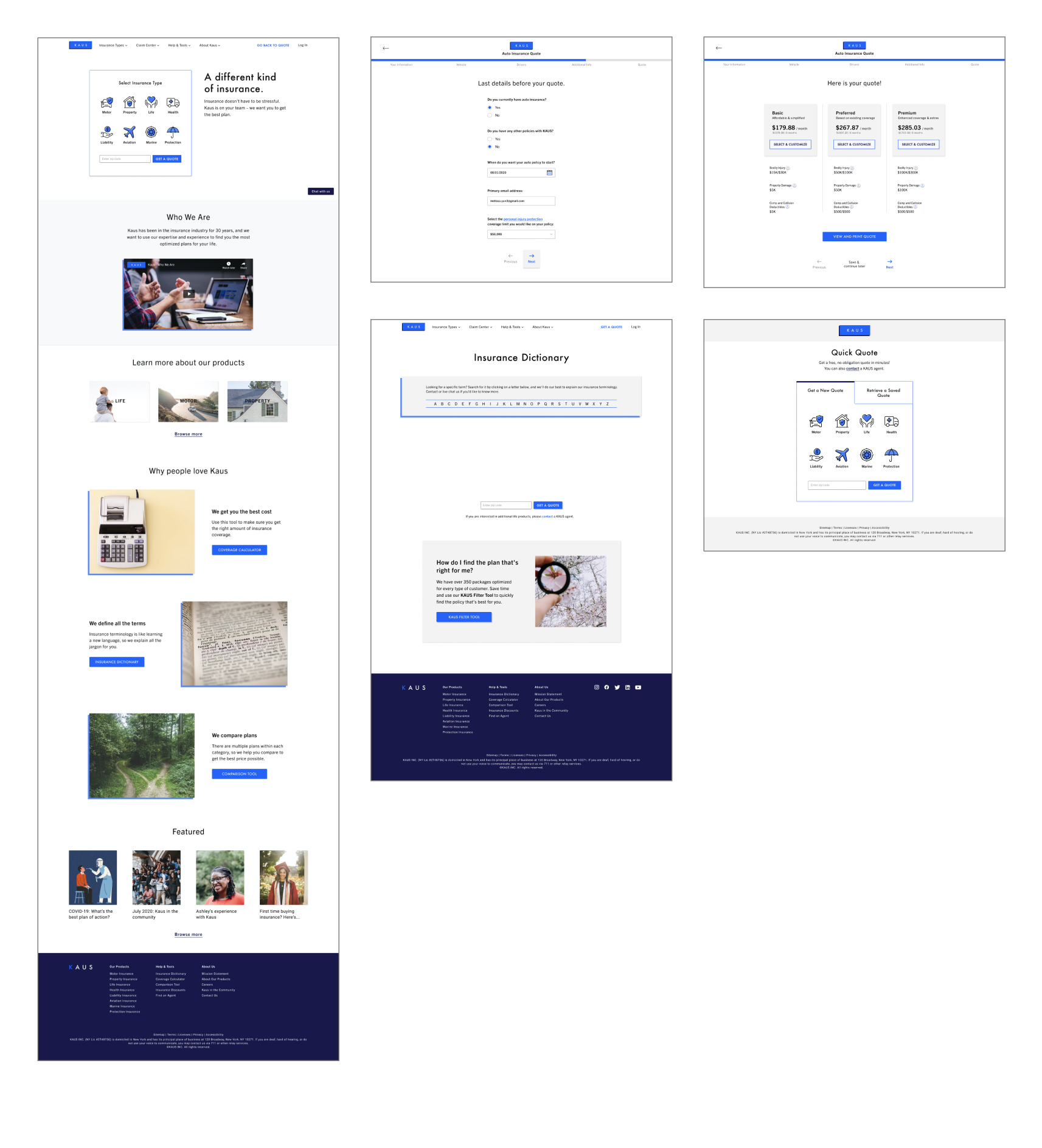
With the responsive UI designs in place, I was able to move onto all the other pages (as laid out in my UI Requirements list) involved in the two task flows I had previously created. I will note that I had changed one of the tasks to Melissa getting a motor insurance quote instead of renter’s insurance. This was more consistent with her persona bio as well as one of the insights from the empathy map.
TESTING TESTING, 1, 2, 3
The prototype is part of my evaluative research to make sure that I am solving for the right problem, and it will help me find areas that need improvement. I conducted usability testing, and, as in previous research, started by creating a usability test plan. Some test goals were:
- To understand how users navigate the website
- To better understand what users need as they navigate through the tasks
- To discover user’s frustrations with website
I tested with 7 people, 5 females and 2 males between the ages of 28 and 35. Due to COVID-19, I moderated these tests remotely via Zoom using the think aloud methodology. I asked the participants to verbalize everything they were thinking out loud as they navigated through the website and the tasks.
Scenario 1: You’re looking to change your current car insurance because you want to find a cheaper price, so you go to KAUS to get a quote. Task #1 - Get a quote for motor insurance
Scenario 2: You’re looking to buy life insurance but don’t know much about the different policies. You explore the website to find out more about term life insurance. Task #1 - Learn more about Term Life Insurance
Task #2 - Find the “Insurance Dictionary”
TEST FINDINGS
After conducting this usability test, I created an affinity map based on observations of all 7 participants. After grouping similarities, I found the following:
After conducting this usability test, I created an affinity map based on observations of all 7 participants. After grouping similarities, I found the following:
Affinity Map
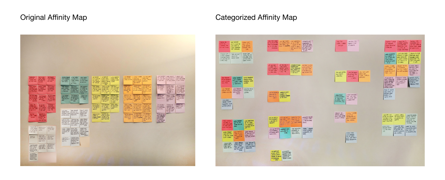
Patterns:
- Unfamiliarity with “Get a Quote” design pattern
- Wanting immediate help for insurance terminology
Insights:
- Users become confused without labels to guide them
- Users want immediately accessible help for understanding terminology
Recommendations:
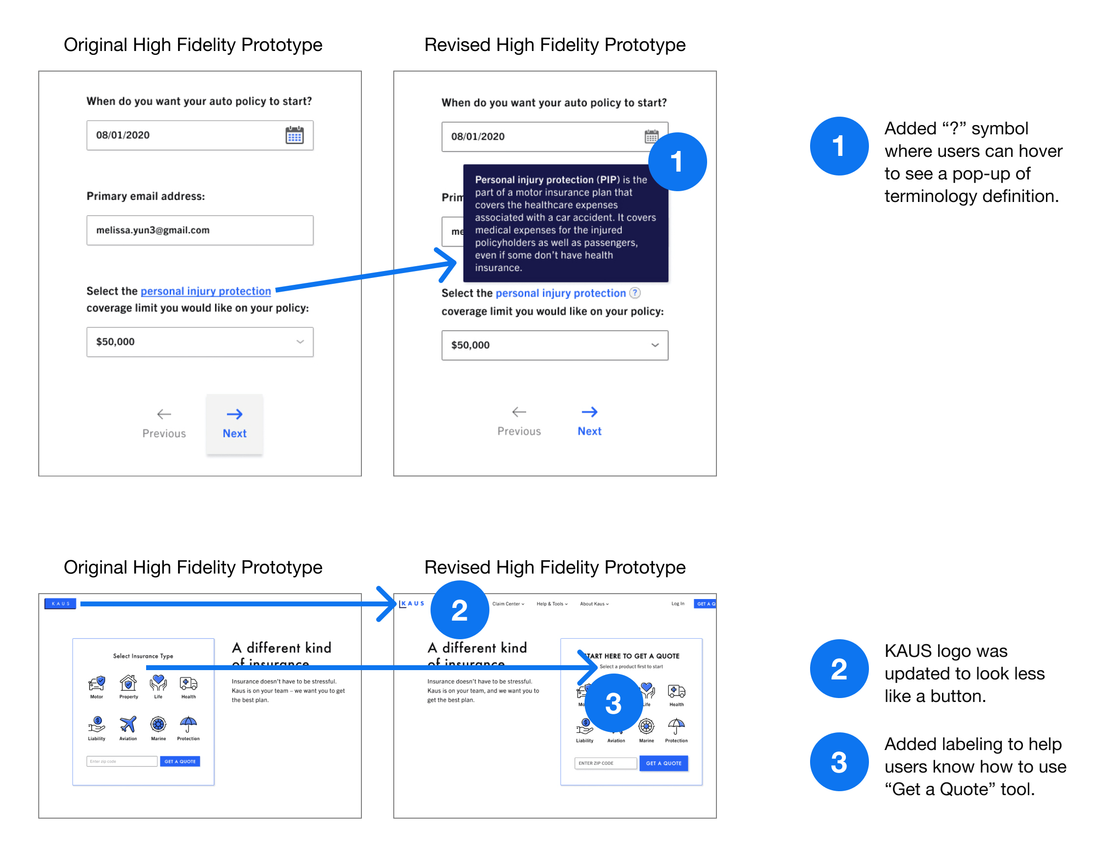
Priority 1 - Add hover-activated pop-ups for terms that need defining in quote wizards
Priority 2 - Label each step clearly with directions in “Get a Quote” container on landing page
Priority 1 - Add hover-activated pop-ups for terms that need defining in quote wizards
Priority 2 - Label each step clearly with directions in “Get a Quote” container on landing page
These findings were very important because they showed me that my assumptions about the importance of the “Insurance Dictionary” for users as well as the usability of the “Get a Quote” feature were wrong.
High Fidelity Prototype with Revisions
To access the prototype, please click here.
To access the prototype, please click here.
AS WE GO ON...
CONCLUSION
The KAUS project, from beginning to end, showed me that while assumptions are strong, data is stronger. As this is my first case study, there was a lot to learn overall, but the user is truly the most crucial focus as the success of a product lies in its ability to do what it was designed to do: serve the user and their needs.
In this case, less is more. My initial interpretation of solving the user’s need by providing more tools was incorrect because what Melissa really needed was instant access to definitions of terms to save time while gaining confidence in herself and trust in the product.
TLDR: Ultimately, testing is my best friend, and the user is my queen.
NEXT STEPS
- Add more functionality and features to prototype
- 2nd round of usability testing with updated prototype and different scenarios/tasks
- After synthesizing test findings, hand off prototype to developers
- Start with priority level 1 items from feature roadmap
