Diane’s: Beloved Water Ice Shop
Case Study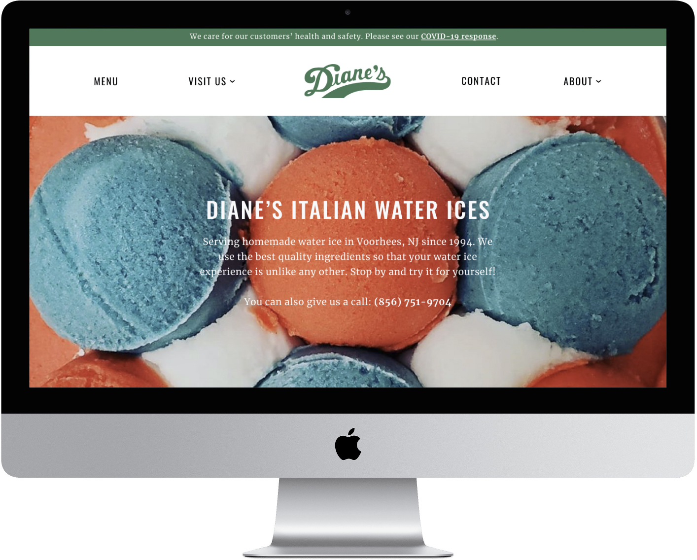
PROJECT OVERVIEW
The Challenge: Diane’s is a beloved, local dessert spot that specializes in water ice and gelati. The business has been around since 1994, but they don’t have a website. Diane’s wants to better serve their customers while continuing to keep costs low with a responsive website.
Click here to access the high fidelity prototype.
Role: Sole designer
Mentor: Alan Hurt Jr.
Time: 4 weeks
Tools: Figma, Zoom, InVision, Adobe Illustrator
Mentor: Alan Hurt Jr.
Time: 4 weeks
Tools: Figma, Zoom, InVision, Adobe Illustrator
STARTING WITH EMPATHY
In order to create the best product for Diane’s and their loyal customer, I needed to understand: 1) who is our user and 2) what are their needs? Thus, I began this process with research. I created a research plan to learn more about the frozen dessert industry, our competitors, and the local audience. It was also crucial to write out all my assumptions to test these hypotheses and create awareness of any preconceived notions I might have that would affect the research process.
LET’S GET DOWN TO RESEARCH
Research Goals:
Assumptions:
Methodologies:
1. Secondary research:
Research Goals:
- Identify the user’s needs for a website
- Find out local competitors’ strengths and weaknesses
- Empathize with user and needs to best serve them
Assumptions:
- Older customers would benefit more from a website than younger customers
- Younger customers find all the information they need from Instagram
- An updated website with COVID-19 procedures is important to customers
Methodologies:
1. Secondary research:
- Market research - To study the dessert industry and trends
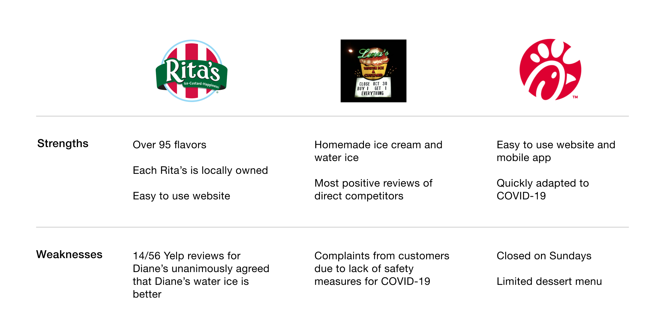
- Competitive Analysis - To determine strengths and weaknesses of competitors’ websites to see how they are helping their customers
- Customer interviews - To gather qualitative data by conducting remote interviews with local patrons
Competitive Analysis
GETTING TO KNOW THE LOCALS
These interviews were crucial in the research process as I gained insight on who the user is and their needs by creating an empathy map from interview observations. Some assumptions were validated and some were not, which helped provide a more focused direction for possible solutions.
- 6 females, 2 males
- Ages 25-40
- Average time duration: 12 minutes
These interviews were crucial in the research process as I gained insight on who the user is and their needs by creating an empathy map from interview observations. Some assumptions were validated and some were not, which helped provide a more focused direction for possible solutions.
Empathy Map
Each post-it color represents an interview participant, and the image on the right displays clusters that were formed by the similar patterns found in my observations of our conversations. From those clusters, I was able to form insights about the users, and then I extrapolated the needs from those insights.

Insights:
- Convenience (distance) is important to customers
- Users value Diane’s being a local business
- There is no centralized source for users to get information about Diane’s
- Users find great value in things that only Diane’s offers
- Diane’s functions as a place for people to get together
Needs:
- Users need to live close to frequent Diane’s
- Users need to feel connected to the establishments they support
- Users need a reliable resource that has information about Diane’s
- Users need places that allow them to gather with others
AMIRIGHT? OR AMIRIGHT? Which of my assumptions were proven correct or incorrect?
- Older customers would benefit more from a website than younger customers ︎
- Younger customers find all the information they need from Instagram ︎
- An updated website with COVID-19 procedures is important to customers ︎
DEFINING THE USER & THE PROBLEM
Persona
The empathy map was also the source of finding out the user’s goals, needs, frustrations and motivations. Other parts of her persona (age, occupation, bio) were a composite of the users I interviewed and the similarities among them.
The empathy map was also the source of finding out the user’s goals, needs, frustrations and motivations. Other parts of her persona (age, occupation, bio) were a composite of the users I interviewed and the similarities among them.

“I like how it’s a place where everyone meets up and hangs out.”
Project Goals
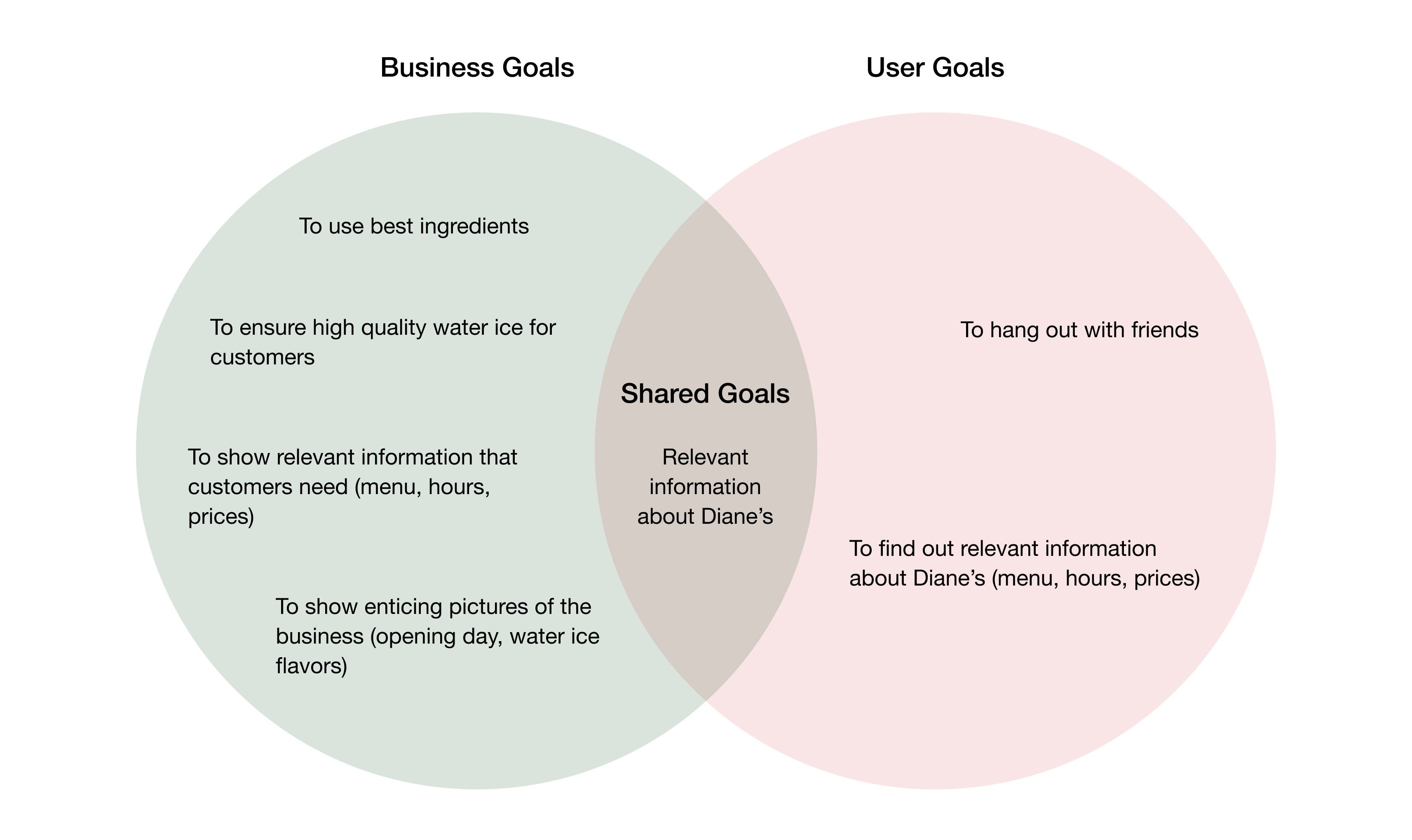
Brainstorm

Point of View Statement:
Laura needs a reliable resource to get information about Diane’s because there is none.
Laura needs a place where she can hang out with people because spending time with others is important to her.
I know the user, I have the problems I want to focus on – let’s design the solution!
Laura needs a reliable resource to get information about Diane’s because there is none.
Laura needs a place where she can hang out with people because spending time with others is important to her.
I know the user, I have the problems I want to focus on – let’s design the solution!
LAYING DOWN THE STRUCTURE
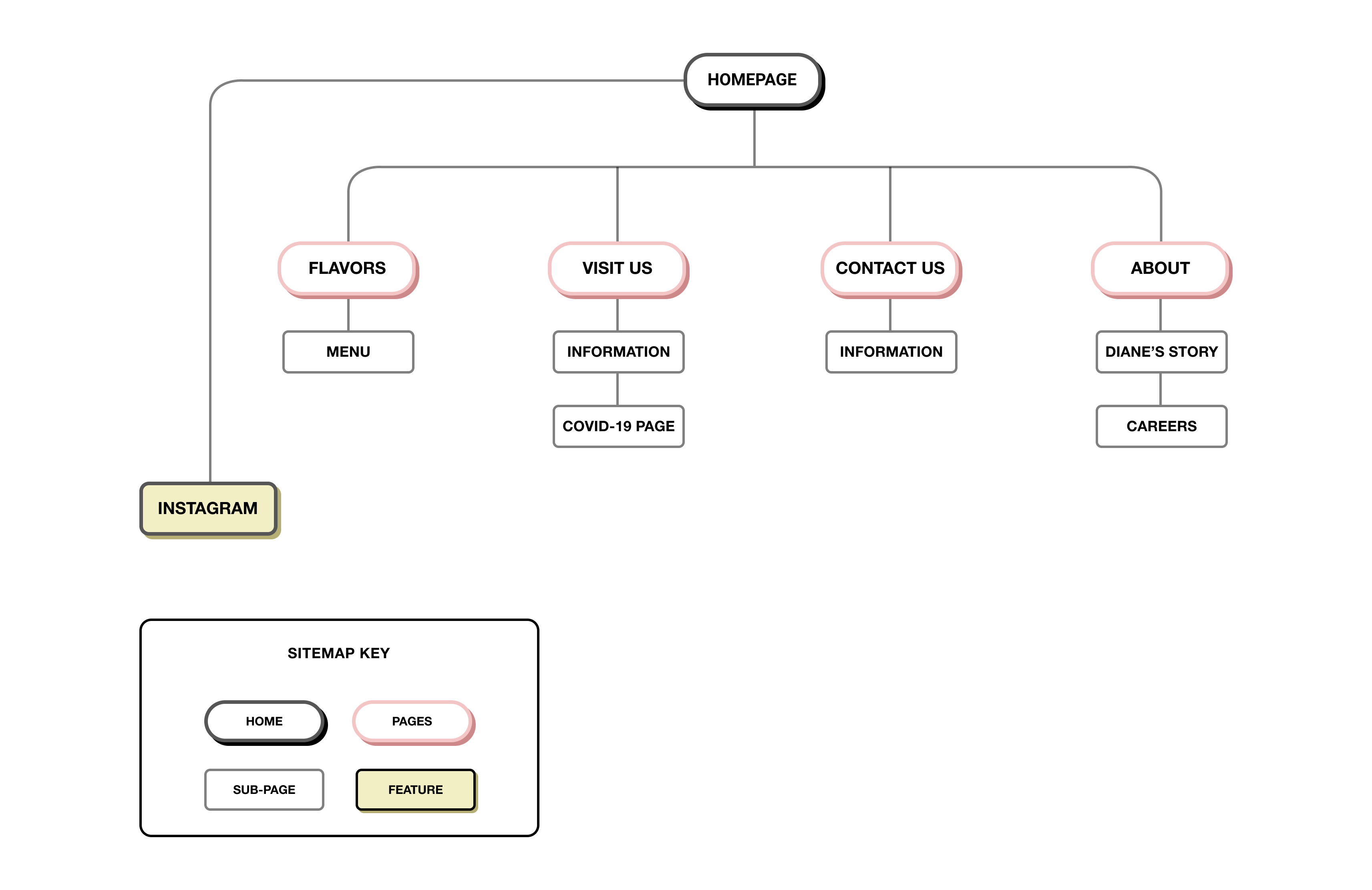
Before diving into brainstorm and design mode, I created a sitemap by looking at competitors’ websites as well as making sure that, if possible, we were addressing our user’s needs through the structure.
Before diving into brainstorm and design mode, I created a sitemap by looking at competitors’ websites as well as making sure that, if possible, we were addressing our user’s needs through the structure.
Sitemap
IDEATE AWAY
Now that I have the sitemap for the Diane’s website, I spent some time brainstorming the detailed requirements and prioritization and compiled them into a feature roadmap.
Feature Roadmap
LET IT FLOW
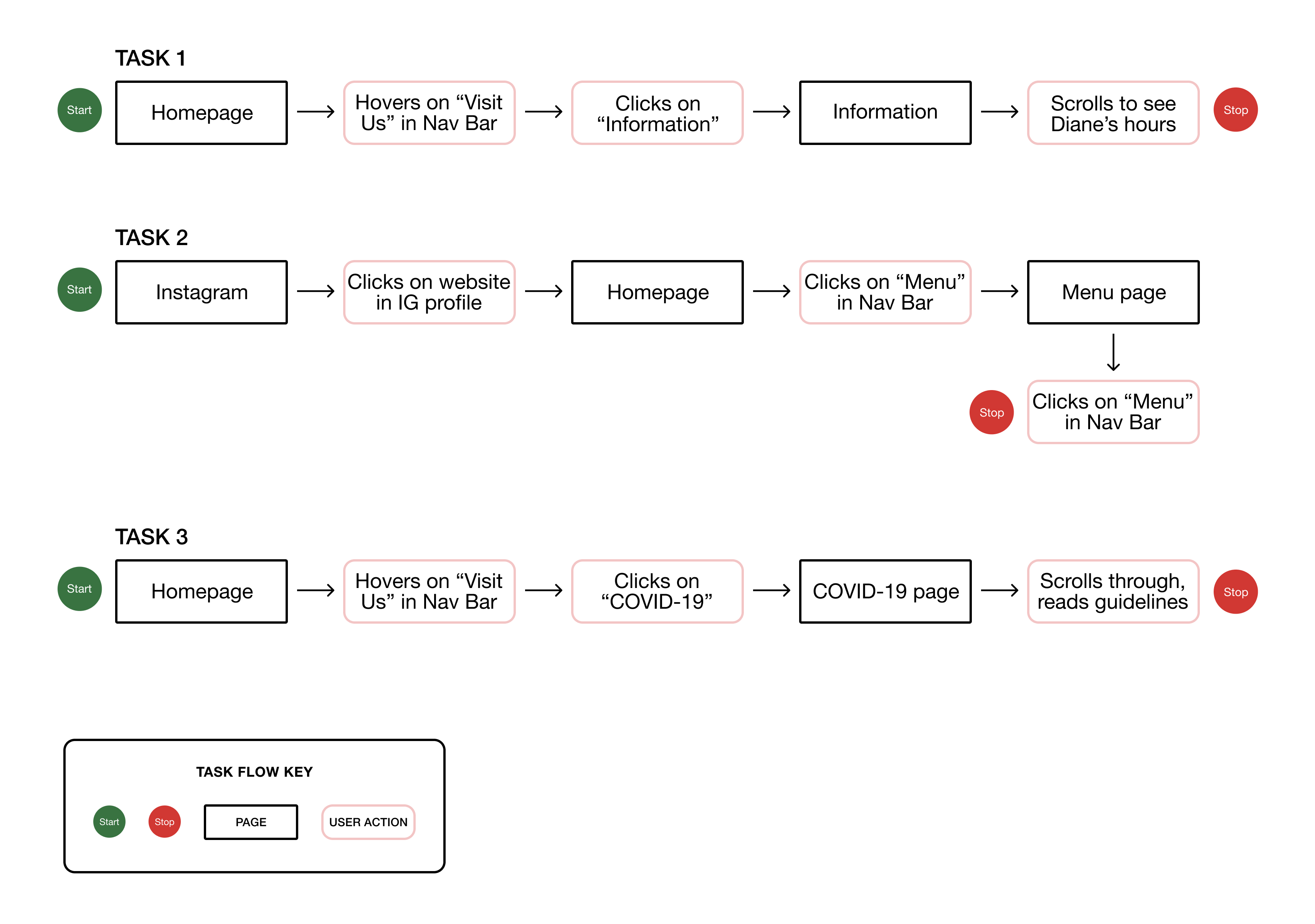
After having established the sitemap and a feature roadmap, I wanted to further investigate how our user would navigate through tasks on the Diane’s website. One of Diane’s business goals was to keep costs low while Laura wants to be able to find information. I would like to create a product that fulfills these goals and will use the task and user flows to do so.
After having established the sitemap and a feature roadmap, I wanted to further investigate how our user would navigate through tasks on the Diane’s website. One of Diane’s business goals was to keep costs low while Laura wants to be able to find information. I would like to create a product that fulfills these goals and will use the task and user flows to do so.
Task Flow Chart
LET’S GET VISUAL
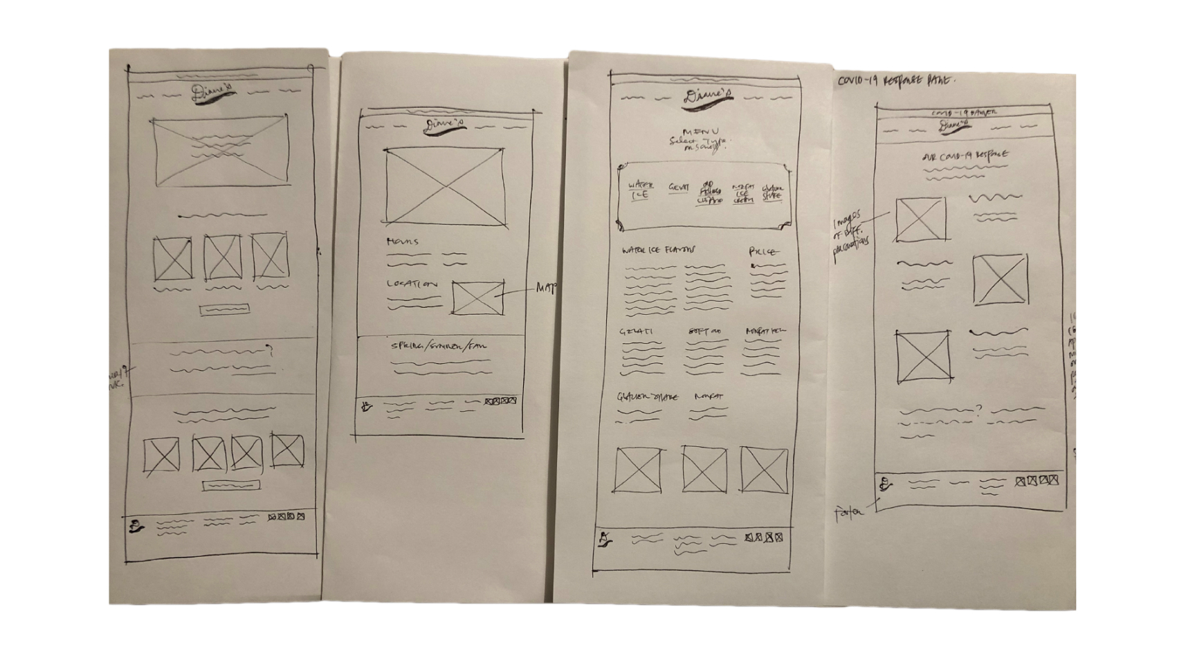
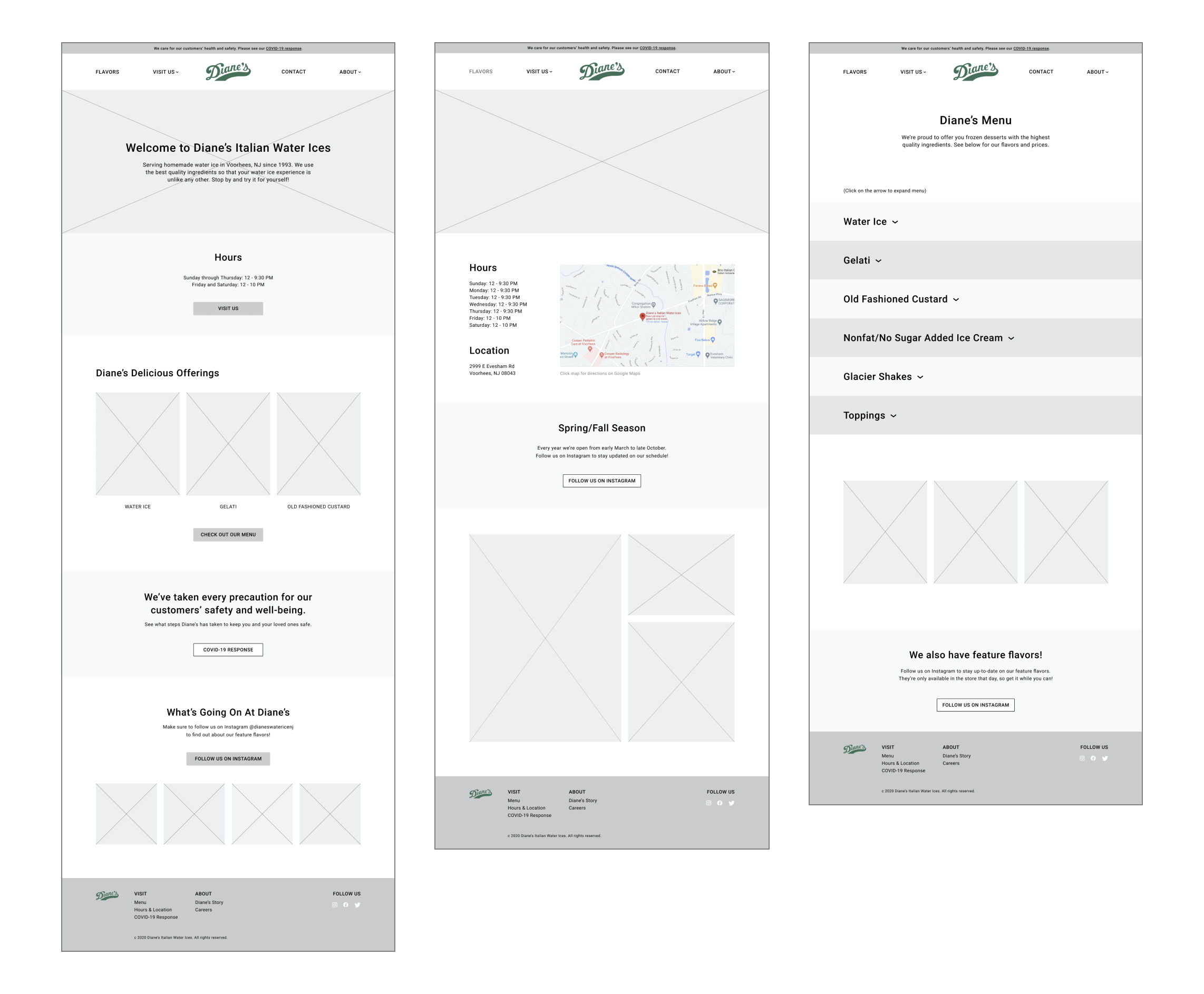
The task and user flows helped me to determine what pages I would need to design for a prototype. I then created a UI Requirements list detailing what I would need to design for each page and made sure to include design patterns that were consistent on our competitors’ websites.
The task and user flows helped me to determine what pages I would need to design for a prototype. I then created a UI Requirements list detailing what I would need to design for each page and made sure to include design patterns that were consistent on our competitors’ websites.
Low Fidelity Wireframe Sketches
Left to right: Homepage, Information, Menu, COVID-19 Response
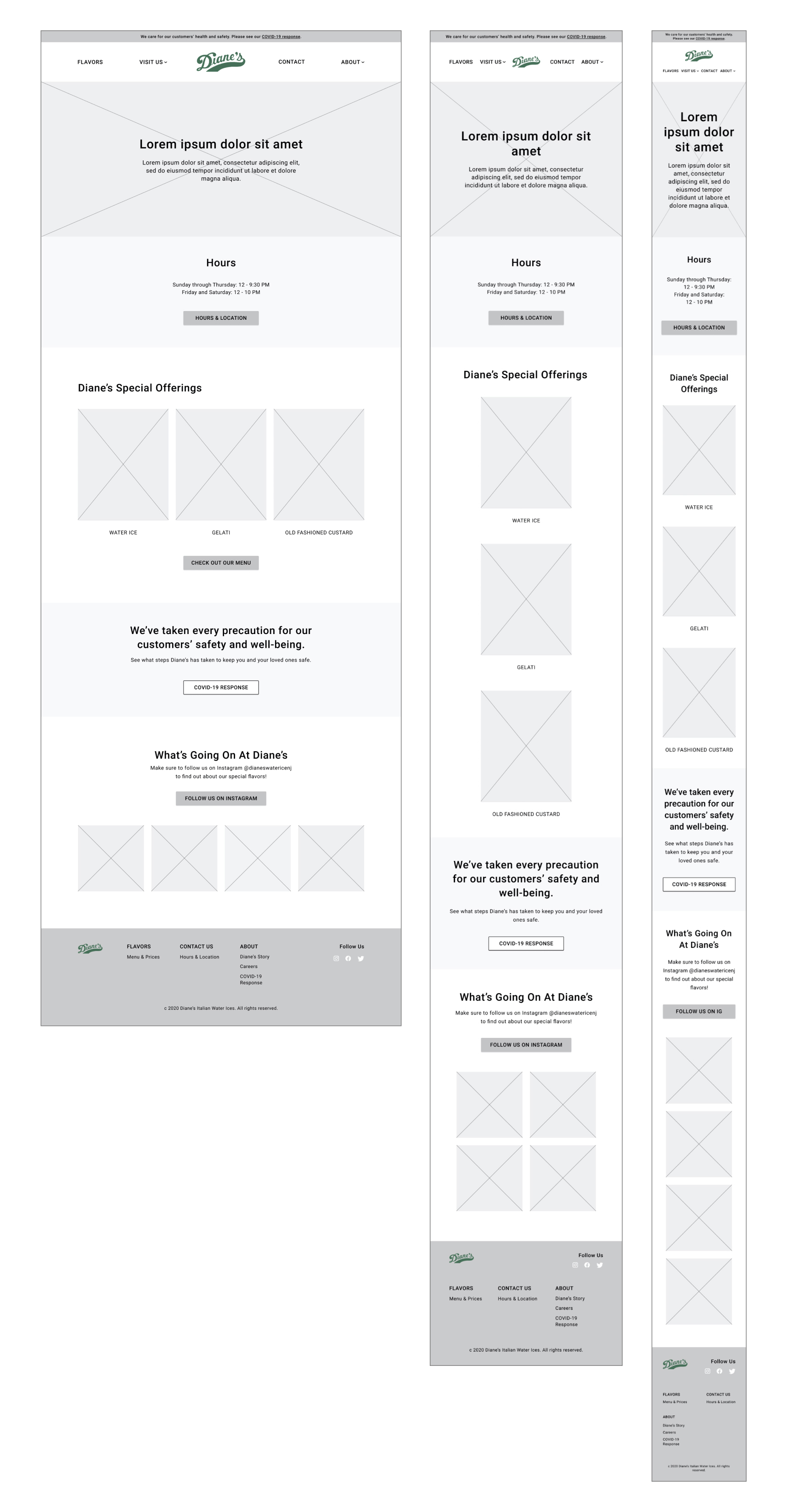
Responsive Mid-Fidelity Wireframes for Homepage
Left to right: Desktop, Tablet, Mobile
Left to right: Desktop, Tablet, Mobile
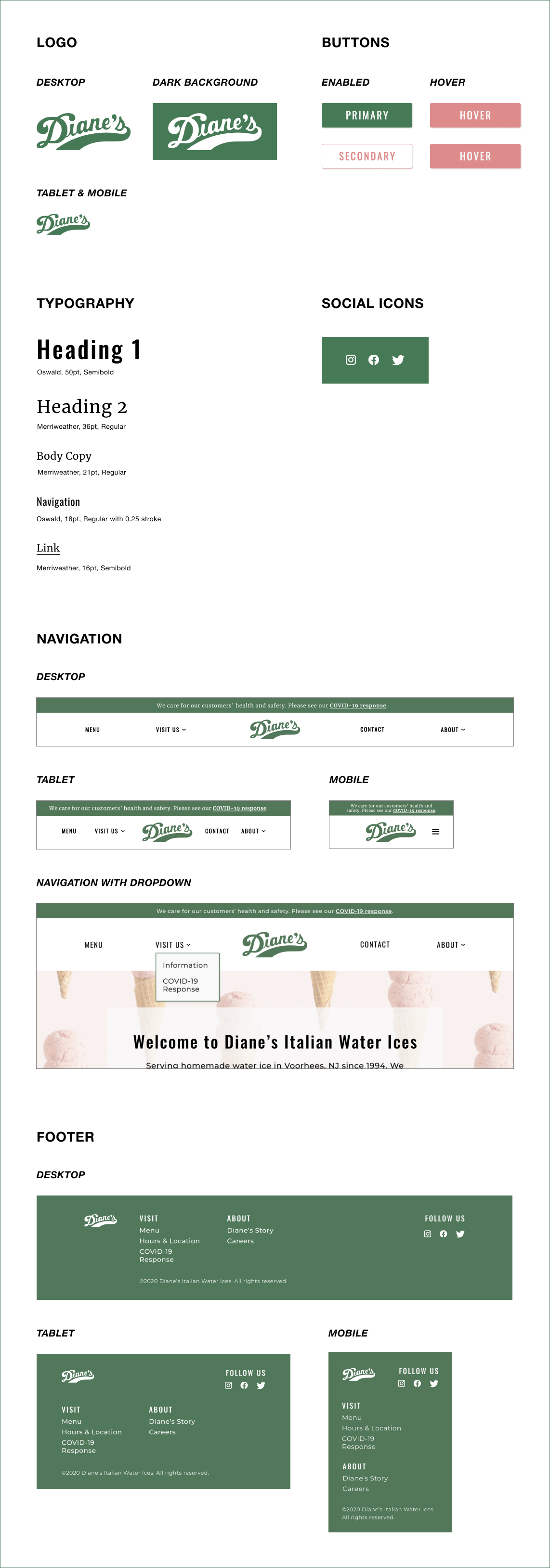
REFINING DIANE’S VISUAL VOICE
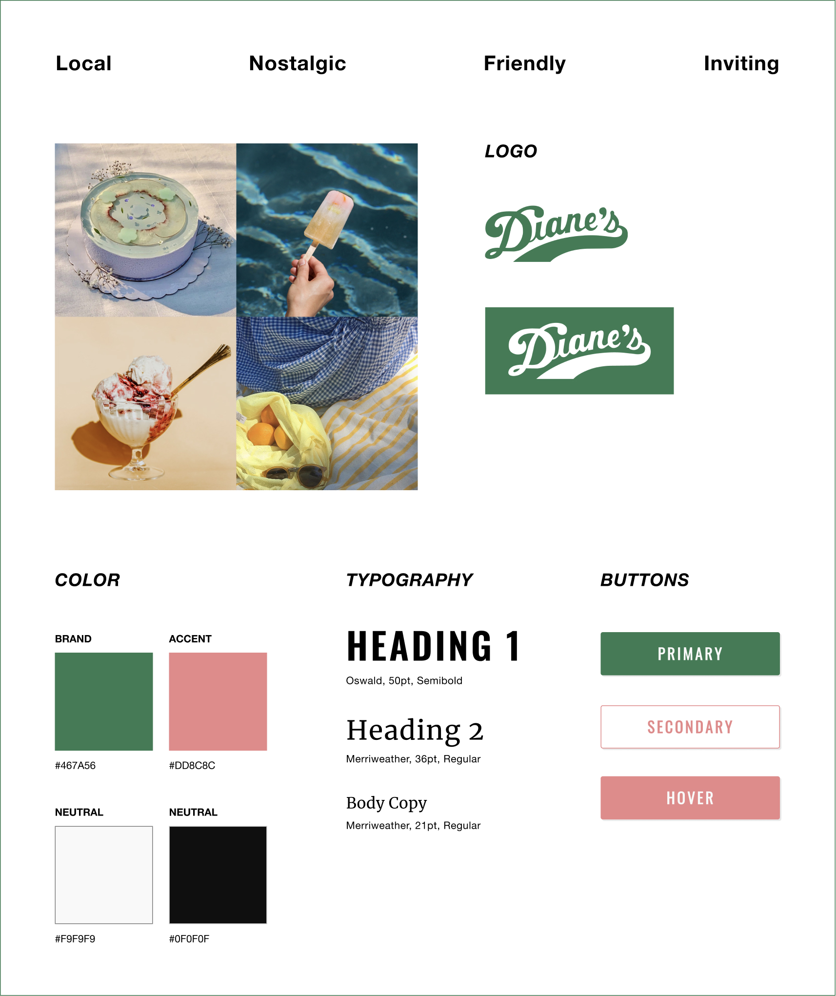
This is one of my favorite parts of the design process, but what was unique in this project was Diane’s already established brand and logo. The Diane’s logo has not changed since 1994, and both the owner and the customers (from primary research) made it clear that this was part of their charm and history. As such, I knew that I would not need to make any changes to the logo, but I did simplify it.
The brand attributes, which were determined upon speaking with Diane’s owner, are as follows:
- Local
-
Nostalgic
- Friendly
- Inviting
Style Tile
UI Kit
PROTOTYPE
With the responsive UI designs in place, I was able to move onto all the other pages (as laid out in my UI Requirements list) involved in the three task flows I had previously created.
TESTING TESTING, 1, 2, 3
The prototype is part of my evaluative research to make sure that I am solving for the right problems, and it will help me find areas that need improvement. I conducted usability testing, and, as in previous research, started by creating a usability test plan. Some test goals were:
- To understand how users navigate the website
- To discover user’s frustrations with website
- To determine if user’s needs are being met
I tested with 6 millennial, local females between the ages of 25 and 37. Due to COVID-19, I moderated these tests remotely via Zoom using the think aloud methodology. I asked the participants to verbalize everything they were thinking out loud as they navigated through the website and the tasks.
Scenario 1: Your friends are visiting for the weekend, so you want to take them to Diane’s. Task #1 - Find out Diane’s hours for Sunday
Scenario 2: You’re on Diane’s Instagram, and you see that they have the pumpkin pie cheesecake flavor only for today! You want to find out the price for a medium size, so that you know how much cash to bring when you go. Task #1 - Find out the price for a medium water ice
Scenario 3: You want to take your friend, who’s a mother, to Diane’s. She wants to bring her toddler and asks if it’s safe to go because of COVID-19.Task #1 - Find out the precautions that Diane’s has taken for COVID-19
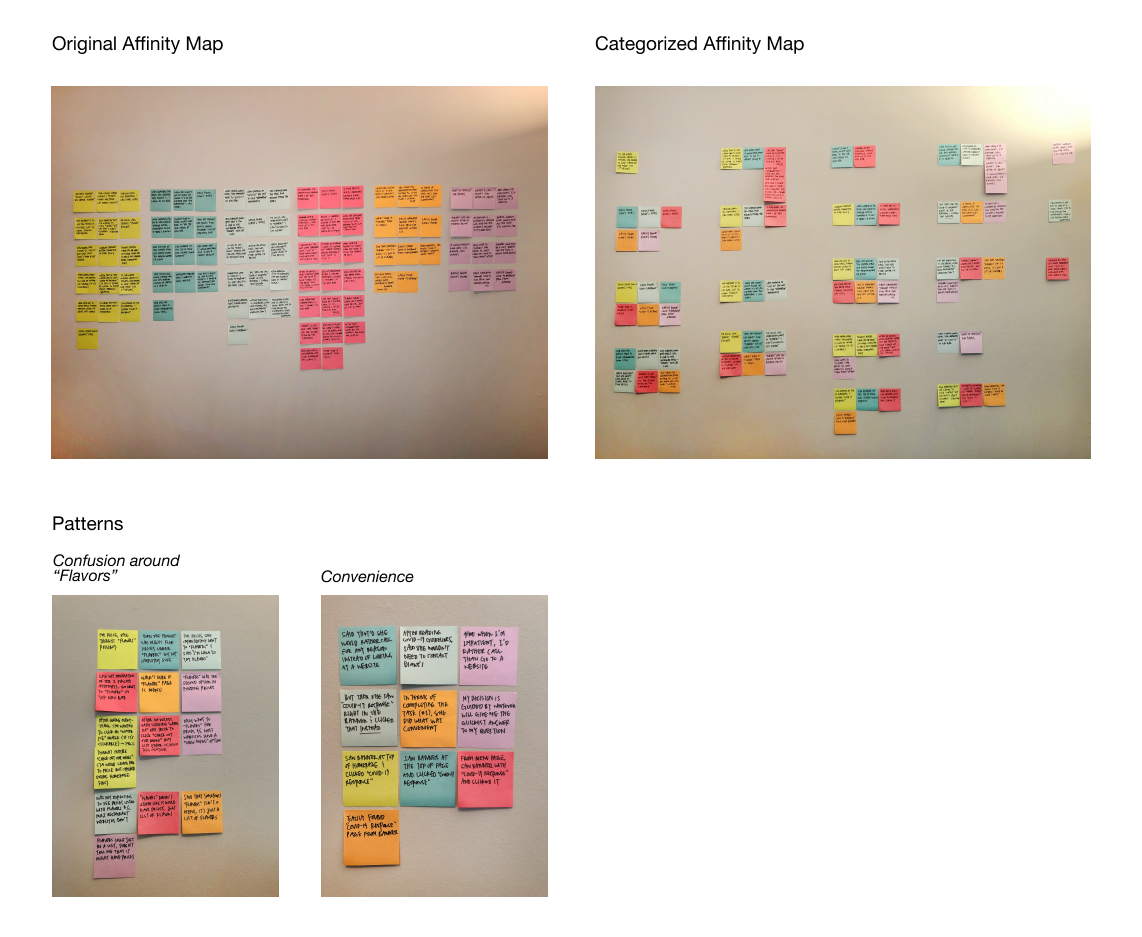
Affinity Map
After conducting this usability test, I created an affinity map based on observations of all 6 participants. After grouping similarities, I found the following patterns and insights which informed my recommendations.
After conducting this usability test, I created an affinity map based on observations of all 6 participants. After grouping similarities, I found the following patterns and insights which informed my recommendations.
Patterns:
-
6/6 users were not sure if they could find water ice prices under “Flavors”
-
6/6 users behaved different when there was greater convenience
Insights:
-
Users do not associate dessert pricing with flavors
- Convenience trumps normal user behavior when navigating websites
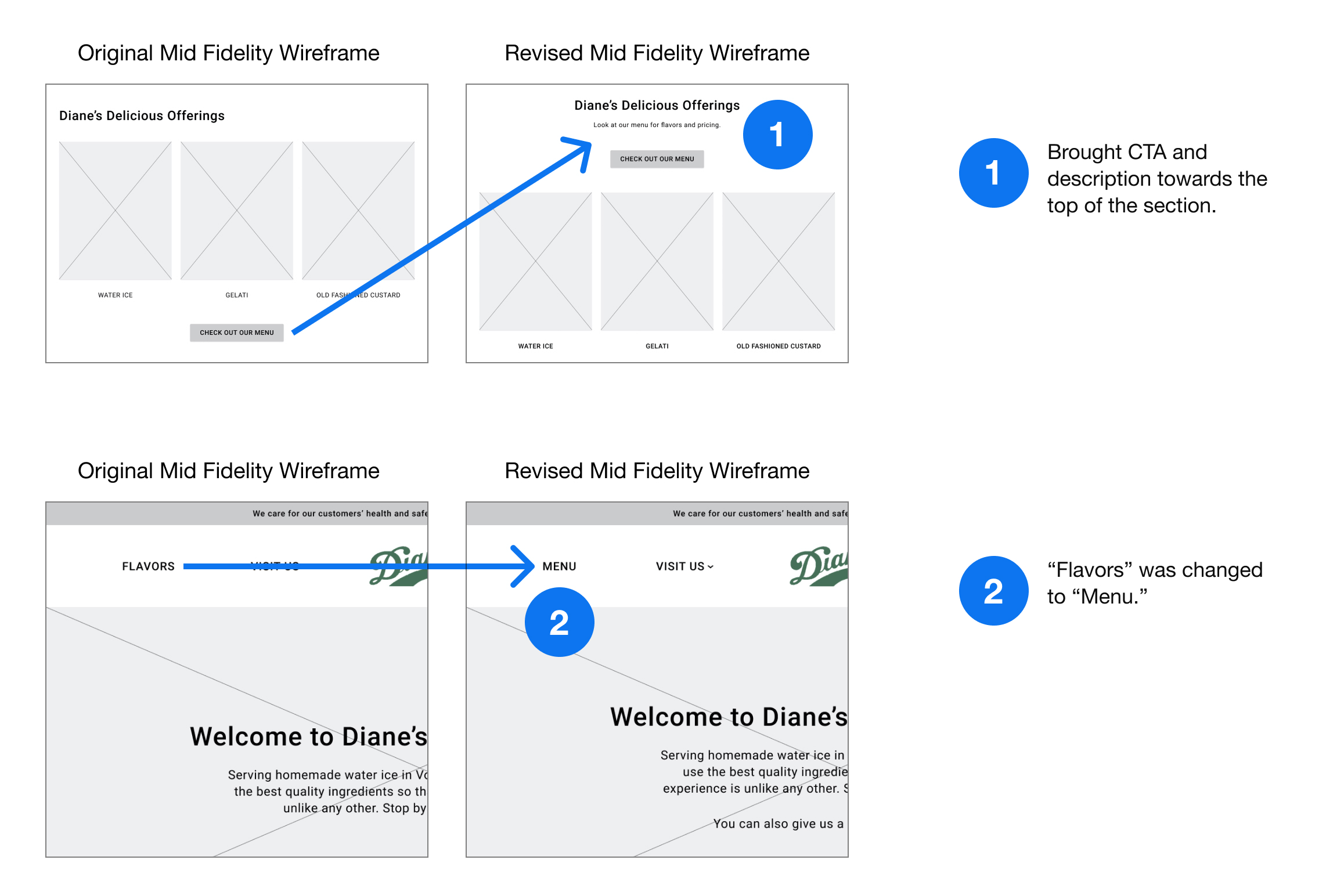
Recommendations:
Priority 1 - Put most important information at the top of the website so users can conveniently locate
Priority 2 - Change labeling of “Flavors” to “Menu” so that users can easily find pricing
Priority 1 - Put most important information at the top of the website so users can conveniently locate
Priority 2 - Change labeling of “Flavors” to “Menu” so that users can easily find pricing
AS WE GO ON...
NEXT STEPS
Due to the pandemic, the business decided not to move forward with implementing the website as there were greater priorities in adjusting to and managing the new operational changes. If we were to move forward, I imagine there may have been some edits and another round of designs. Afterwards, I would have worked with the owner and a Wordpress developer to create the website.
Due to the pandemic, the business decided not to move forward with implementing the website as there were greater priorities in adjusting to and managing the new operational changes. If we were to move forward, I imagine there may have been some edits and another round of designs. Afterwards, I would have worked with the owner and a Wordpress developer to create the website.
CONCLUSION
Due to the pandemic, the business decided not to move forward with implementing the website as there were greater priorities in adjusting to and managing the new operational changes. If we were to move forward, I imagine there may have been some edits and a round of revised designs. Afterwards, I would have worked with the owner and a Wordpress developer to launch the website.
Although the website didn’t ship in the end, I was grateful to have worked with a local business and learned from Diane’s loyal customers.

