Abode: Dwell in Augmented Reality
Case Study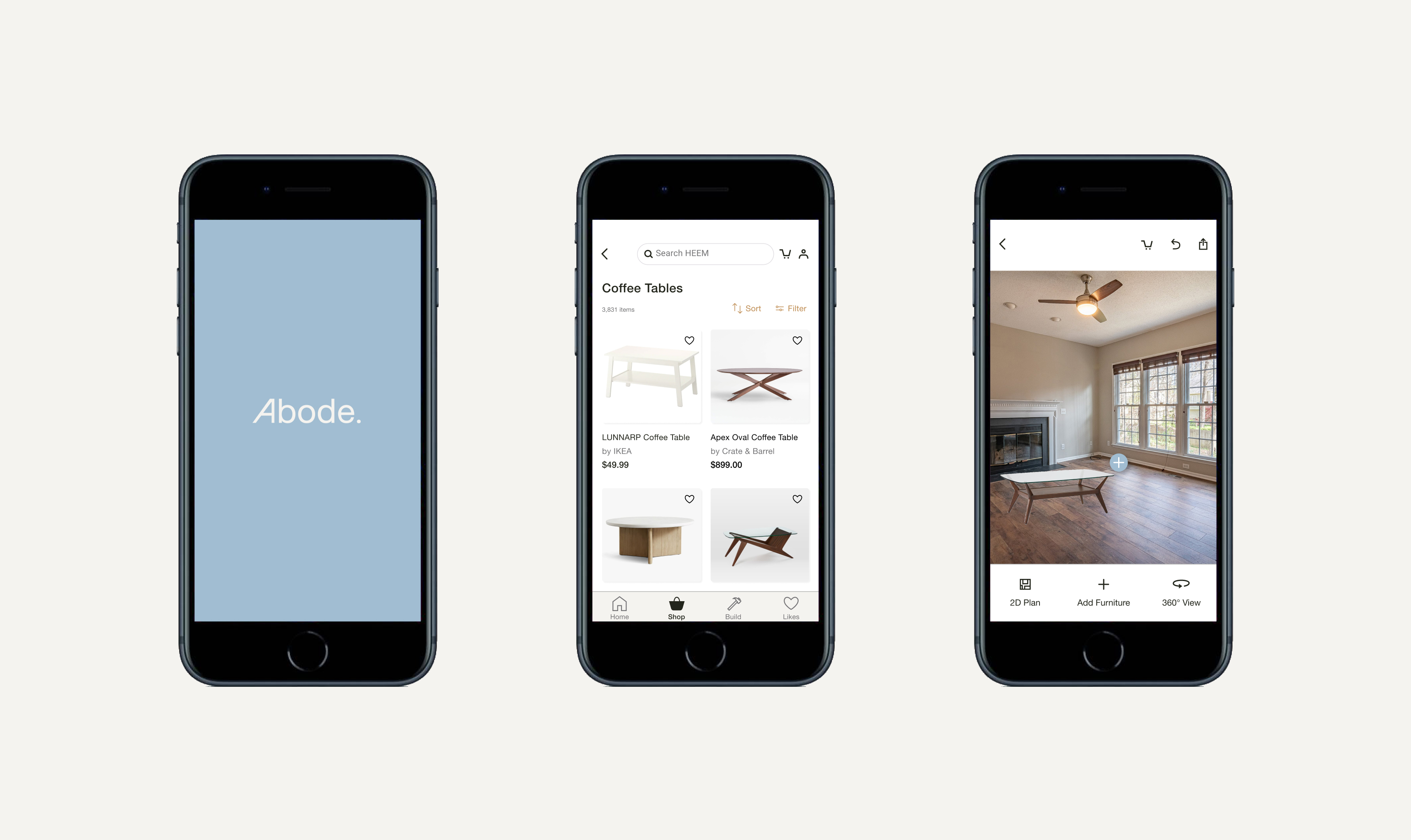
PROJECT OVERVIEW
Abode is a new interior design app and has partnerships with a number of top 10 furniture stores in the U.S. like IKEA, Williams Sonoma, and Crate & Barrel.
The Challenge: Abode wants to find the right usage for augmented reality within their app, which is a new and stunningly hot technology.
The Solution: A “Build” feature that allows users to create 2D and 3D layouts of rooms as well as add any furniture from the extensive Abode catalog to see if items will fit in their spaces.
Click here to access the high fidelity prototype.
Role: Sole designer
Mentor: Alan Hurt Jr.
Time: 4 weeks
Tools: Figma, Zoom, InVision, Adobe Photoshop, and Adobe Illustrator
Mentor: Alan Hurt Jr.
Time: 4 weeks
Tools: Figma, Zoom, InVision, Adobe Photoshop, and Adobe Illustrator
I got questions...
Abode’s challenge is to create an app that will find the right usage for AR technology and allow users to place furniture in their homes. Who are we creating this app for and how do we discover the right usage for this technology? To lean more about interior design and augmented reality technology, I started this case study by making a research plan.Goals of this research:
1. Secondary research:
- Discover the user’s needs in selecting furniture for their homes online
- Identify user’s frustrations when selecting furniture for their homes online
- AR technology will increase the likelihood of users purchasing furniture through Abode’s app
- Users will enjoy the ability to use AR technology in selecting furniture for their homes
Research questions:
Methodologies:
- What are users’ processes when selecting furniture for their homes?
- What are the most important visual factors for users (product images, zoom, fabric swatches, etc.) when selecting furniture?
1. Secondary research:
- Market research - looking at existing research to understand the trends in the interior design and AR industries
- Competitive analysis - gathering data about other interior design apps, especially their strengths and weaknesses
- Customer interviews - conducting remote interviews with frequent online furniture shoppers to better understand what users need
Secondary Research
Competitive Analysis
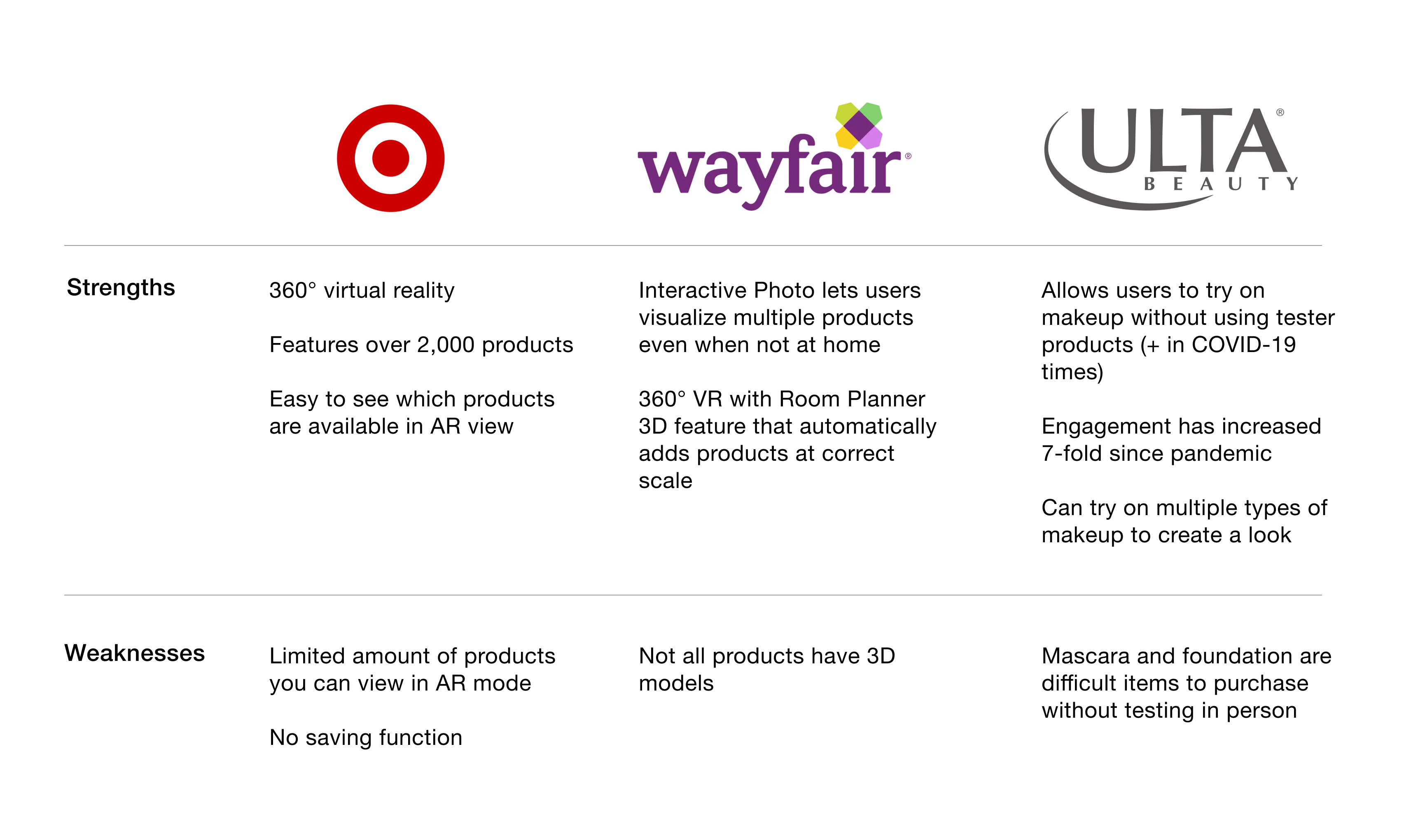
Competitive analysis and market research were the secondary research methodologies I used to better understand the interior design and AR worlds. Wayfair was the strongest competitor, and I examined their app carefully.
Competitive analysis and market research were the secondary research methodologies I used to better understand the interior design and AR worlds. Wayfair was the strongest competitor, and I examined their app carefully.
Provisional Personas
Most of the data from my market research surrounding demographics showed that female millennials and Gen X-ers were the most active shoppers for furniture online. I created two provisional personas that would act as a guide for finding interview participants.
Most of the data from my market research surrounding demographics showed that female millennials and Gen X-ers were the most active shoppers for furniture online. I created two provisional personas that would act as a guide for finding interview participants.

Primary Research
Customer Interviews
- 9 interview participants
- 6 female millennials, 3 female Gen X-ers
- Ages 27-41
These interviews were crucial in better understanding users’ frustrations and needs when it came to shopping for furniture online.
Empathy Map
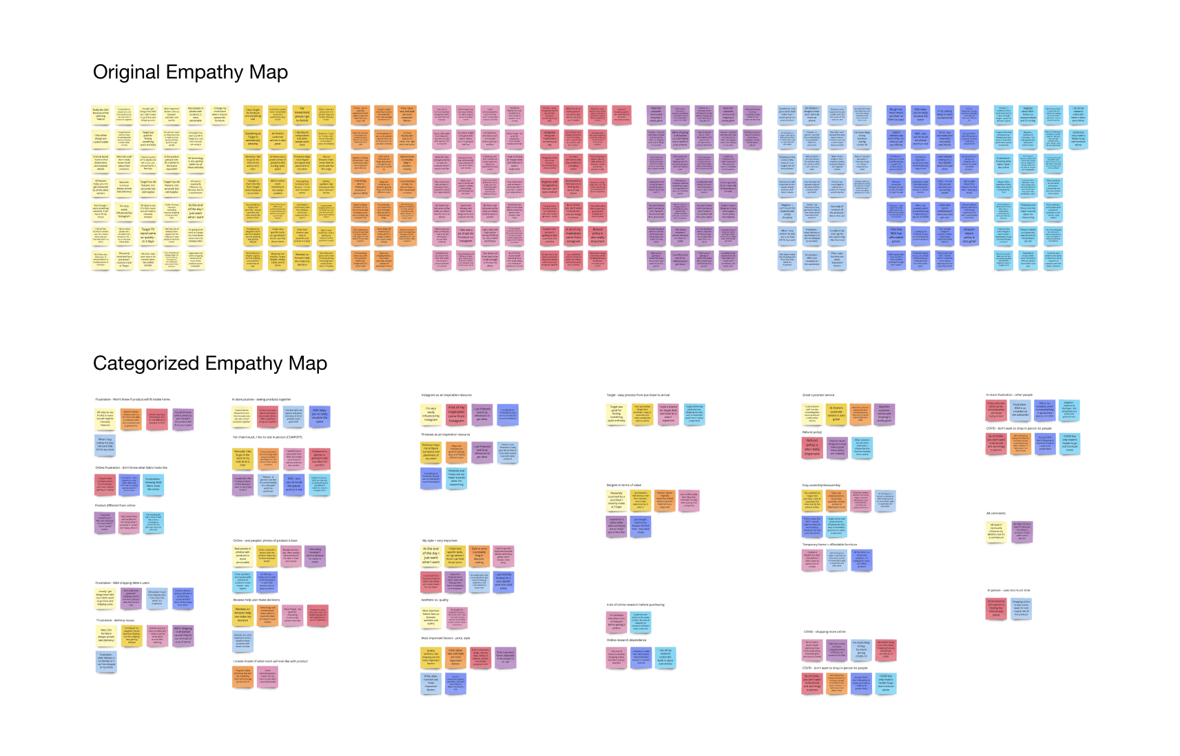
Original empathy map: each color post-it represents an interview participant. Categorized empathy map: the groupings were formed by similar patterns found in my observations from the conversations. From those clusters, I was able to form insights about the users, and then I extrapolated the needs from those insights.
Insights
1. Users heavily rely on online reviews to give them assurance of their furniture product selection
2. When it comes to furniture, users’ greatest desire is to achieve a specific look for their home
1. Users heavily rely on online reviews to give them assurance of their furniture product selection
2. When it comes to furniture, users’ greatest desire is to achieve a specific look for their home
Needs
1. Users need a lot of information to feel good about their furniture selections
2. Users need to find furniture that matches their design aesthetic
“‘Cause I’m your lady...”
After synthesizing the data using the empathy map, I compiled the goals, motivations and frustrations from the interviews and created a profile for my user persona.
User Persona
Other parts of the user persona (age, occupation, bio) were a composite of the majority of the users I interviewed.
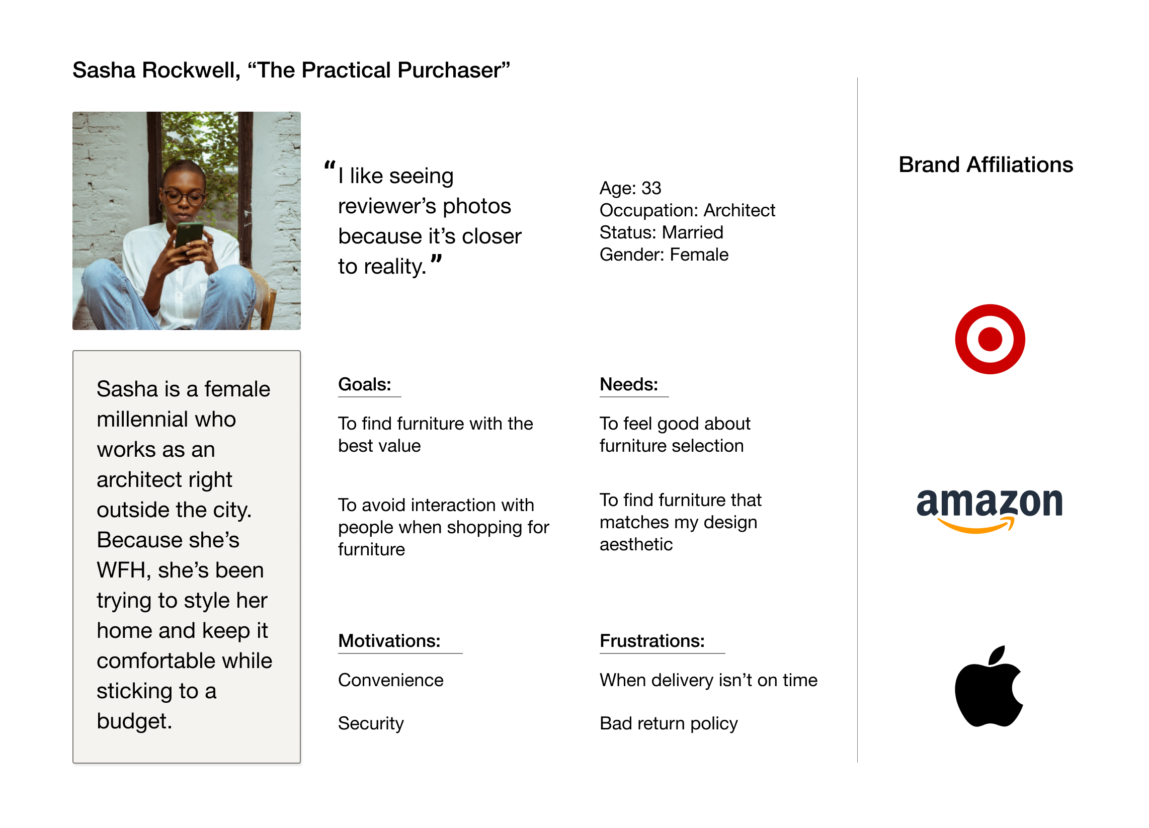
“I like seeing reviewer’s photos because it’s closer to reality.”
Sasha Rockwell is our user persona, so the primary research helped to answer who our target user is. Now the question is, what problem are we solving for? Do we solve for all the user’s needs? How do we balance the business’ requests with the users’ needs? These are some questions I hope to answer next.
POV/HMW Chart
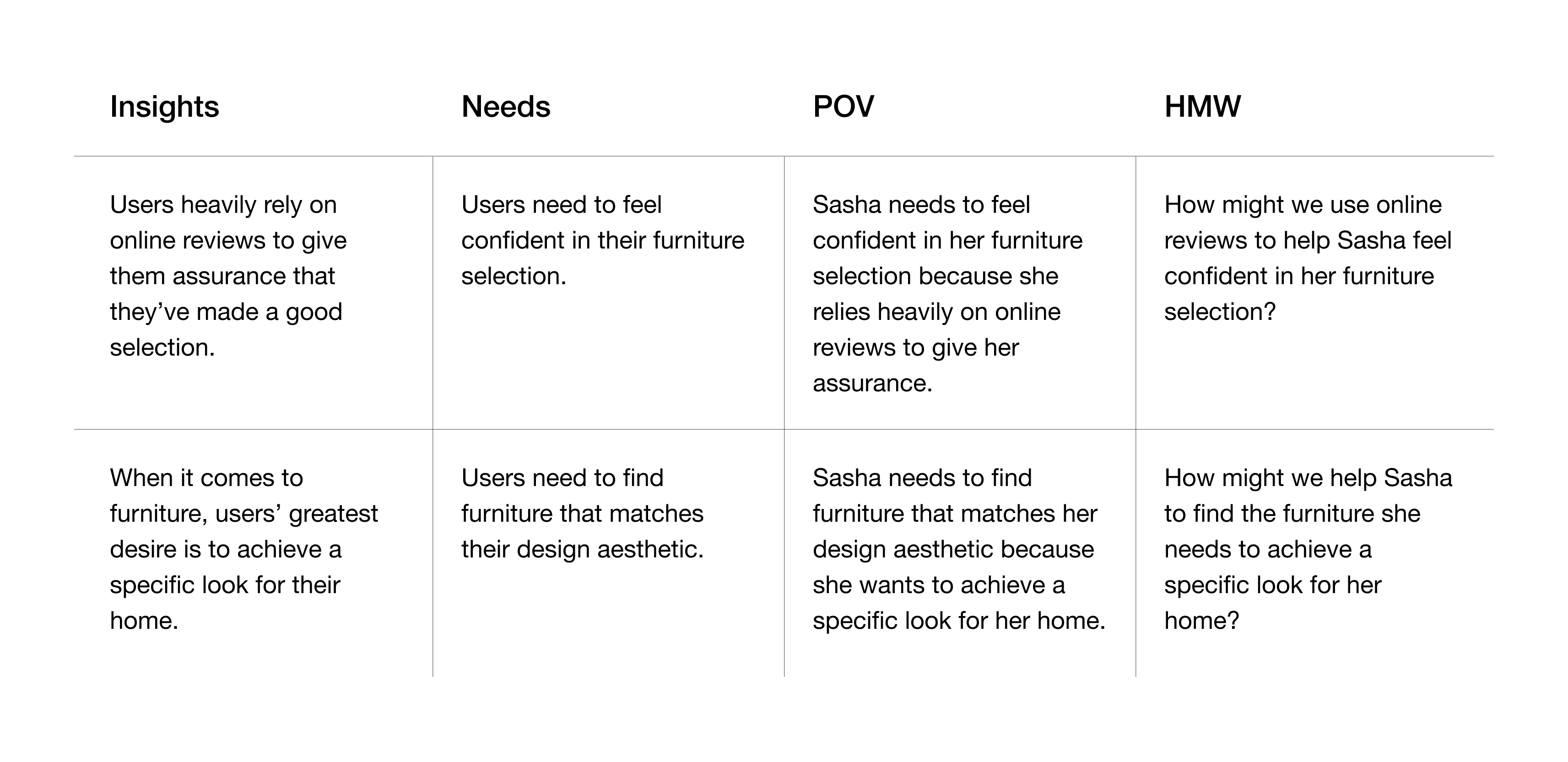
After creating a POV/HMW chart, I brainstormed using the mind mapping method for the first time. The mind map was a great way to generate solutions in a visual manner that helped to spark new ideas organically.
Mind Maps
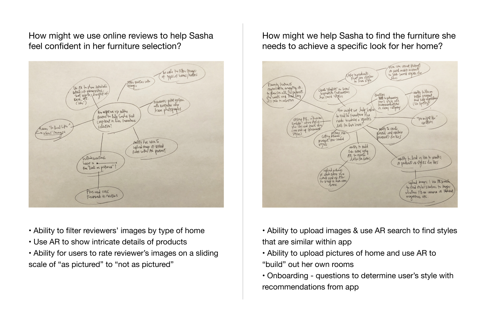
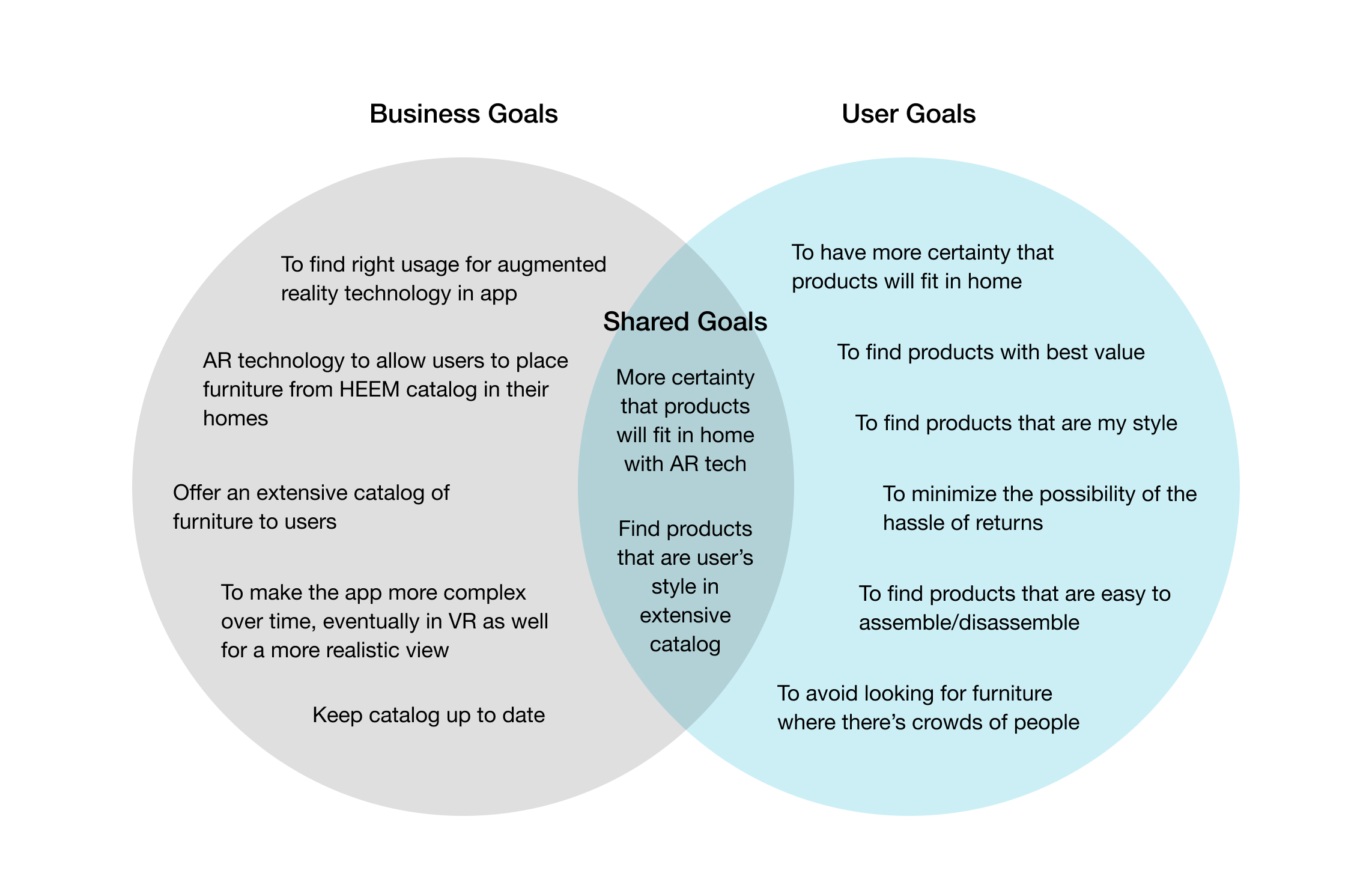
After generating several solutions for each HMW question, it was important to weigh these solutions against the business goals of Abode. To help me organize and visualize the business goals along with the user goals, I created a venn diagram.
Business & User Goals
This venn diagram allowed me to filter out solutions that are not aligned with shared goals.
This venn diagram allowed me to filter out solutions that are not aligned with shared goals.
Product Roadmap
Having brainstormed and defined the parameters for solutions, it’s time to create a product roadmap that lists out the features to be included in the Abode app. The priority level is determined by either the shared goals or explicit asks from Abode that must be included.
Having brainstormed and defined the parameters for solutions, it’s time to create a product roadmap that lists out the features to be included in the Abode app. The priority level is determined by either the shared goals or explicit asks from Abode that must be included.
Application Map
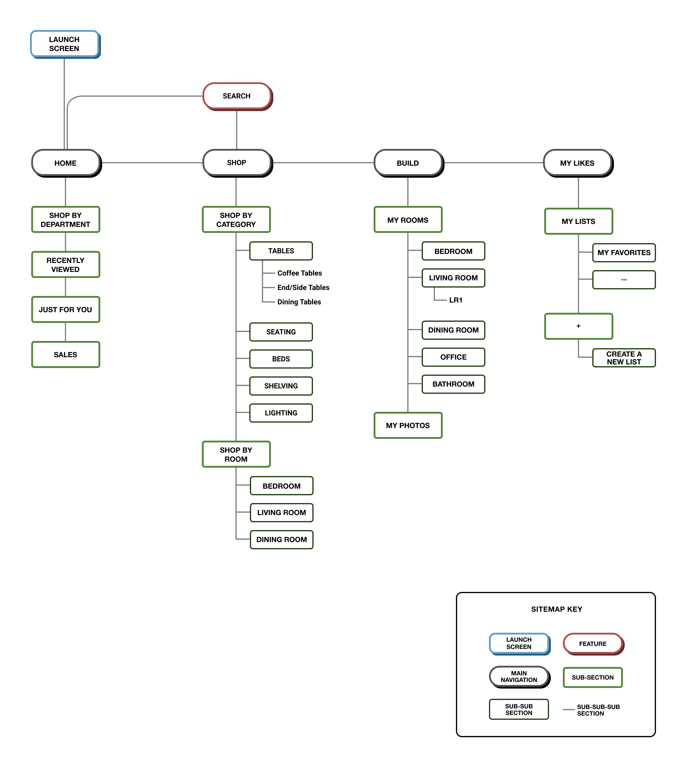
Initially, I had five tabs along the main tab navigation bar. However, upon speaking with my mentor I realized this would not help the app to be scalable over time. What if we needed to add another tab on the navigation? Thus, I moved “My Account” to be accessible from the home screen in hopes that more attention would also be drawn to “Shop” and “Build,” features for which our users have expressed a need.
Initially, I had five tabs along the main tab navigation bar. However, upon speaking with my mentor I realized this would not help the app to be scalable over time. What if we needed to add another tab on the navigation? Thus, I moved “My Account” to be accessible from the home screen in hopes that more attention would also be drawn to “Shop” and “Build,” features for which our users have expressed a need.
When I say solution, you say “Build”
As you can see on the application map, the “Build” feature is the selected solution. Sasha wants to find products that are her style, which would be made available to her in Abode’s extensive and updated catalog. She also wants to make sure that products fit in her home, especially due to frustrations involving delivery delays and annoying return policies. The “Build” feature, using AR technology, will help to ensure that items will fit in her home both physically and aesthetically.
Let’s get to designing
At this point, a UI Requirements Document is a practical way to list out all the screens and details that would be needed to design the Abode app. Part of this document includes user tasks, which helps to create scenarios in which we can put ourselves in Sasha’s shoes.
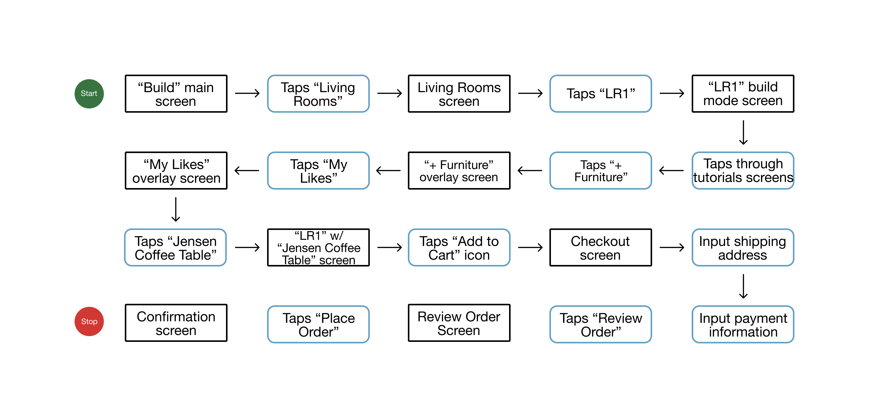
Task Flow
Creating task and user flows helped me to think about how Sasha would navigate through the app as well as determine what other details I would need to design.
Scenario 1: Sasha opens the app for the first time. Task 1 - Search for a coffee table with the following filters: A) up to $250 in price, and B) mid-century modern style. Task 2 - “Like” the “Jensen Coffee Table” (you’ll need to create an account to do so). Task 3 - Finally, create an account with your email (you’ll be brought back to the “Jensen Coffee Table” product screen).
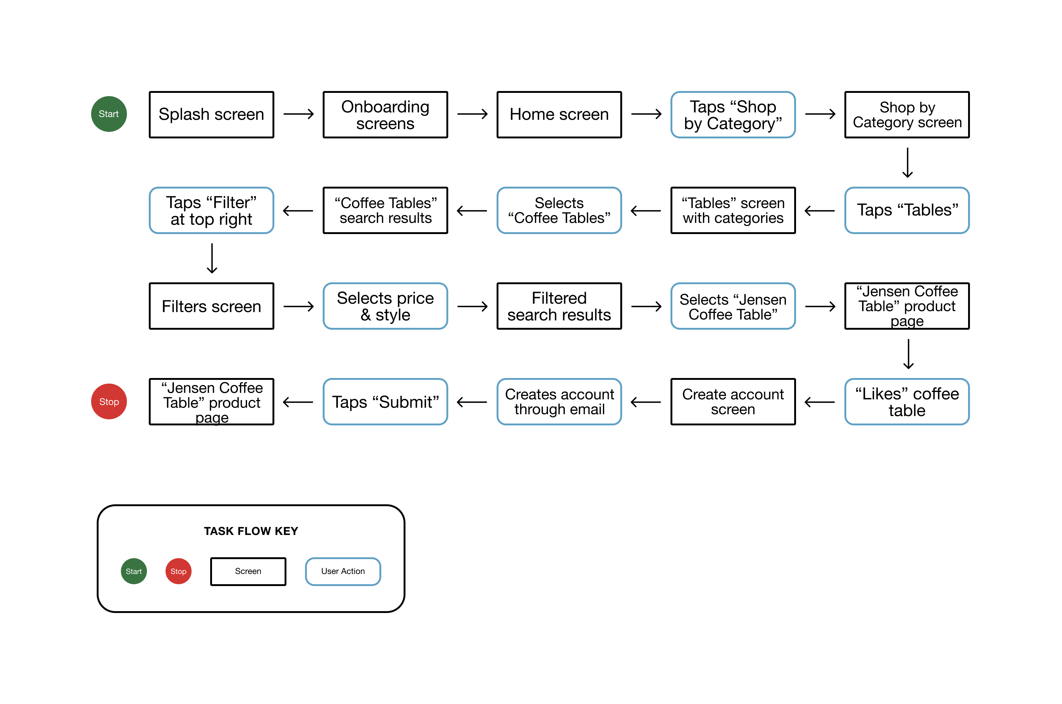
Scenario 2: A week later, Sasha wants to see if the “Jensen Coffee Table” fits in her living room. She’s already created a template called “LR1.”
Task 1 - Add the “Jensen Coffee Table” to your “LR1” living room.
Task 2 - Move the placement of the table.
Task 3 - Satisfied with the table, you purchase it.
Task 1 - Add the “Jensen Coffee Table” to your “LR1” living room.
Task 2 - Move the placement of the table.
Task 3 - Satisfied with the table, you purchase it.
Low Fidelity Wireframes (Sketches)
Here are a few screens that I sketched by hand. There were some changes made from this stage, but each of these screens represents one that would be necessary for users in carrying out the tasks (as shown above in the task flow).
Here are a few screens that I sketched by hand. There were some changes made from this stage, but each of these screens represents one that would be necessary for users in carrying out the tasks (as shown above in the task flow).

Testing the prototype
The low fidelity sketches helped me to design the mid-fidelity prototype that I would use for usability testing. This would allow me to test my solution with female millennials and see if this is a viable solve for Abode’s app.
Test goals:
- To determine usability of “Build” feature
- To identify users’ pain points within the app, especially the “Build” feature
Assumptions to test:
- Users will be able to complete the tasks because they’re already familiar with shopping for and purchasing furniture via an app
- Not every user will be familiar with AR technology, which may affect how they navigate through scenario 2’s tasks
Methodology:
Remotely moderated, thinking aloud testing - participants say out loud everything they are thinking as they navigate through the prototype while attempting to complete the tasks.
Tasks, errands:
Scenario 1: Sasha opens the app for the first time. Task 1 - Search for a coffee table with the following filters: A) up to $250 in price, and B) mid-century modern style. Task 2 - “Like” the “Jensen Coffee Table” (you’ll need to create an account to do so).
Task 3 - Finally, create an account with your email (you’ll be brought back to the “Jensen Coffee Table” product screen).
Scenario 2: A week later, Sasha wants to see if the “Jensen Coffee Table” fits in her living room. She’s already created a template called “LR1.”
Task 1 - Add the “Jensen Coffee Table” to your “LR1” living room.
Task 2 - Move the placement of the table.
Task 3 - Satisfied with the table, you purchase it.
Task 1 - Add the “Jensen Coffee Table” to your “LR1” living room.
Task 2 - Move the placement of the table.
Task 3 - Satisfied with the table, you purchase it.
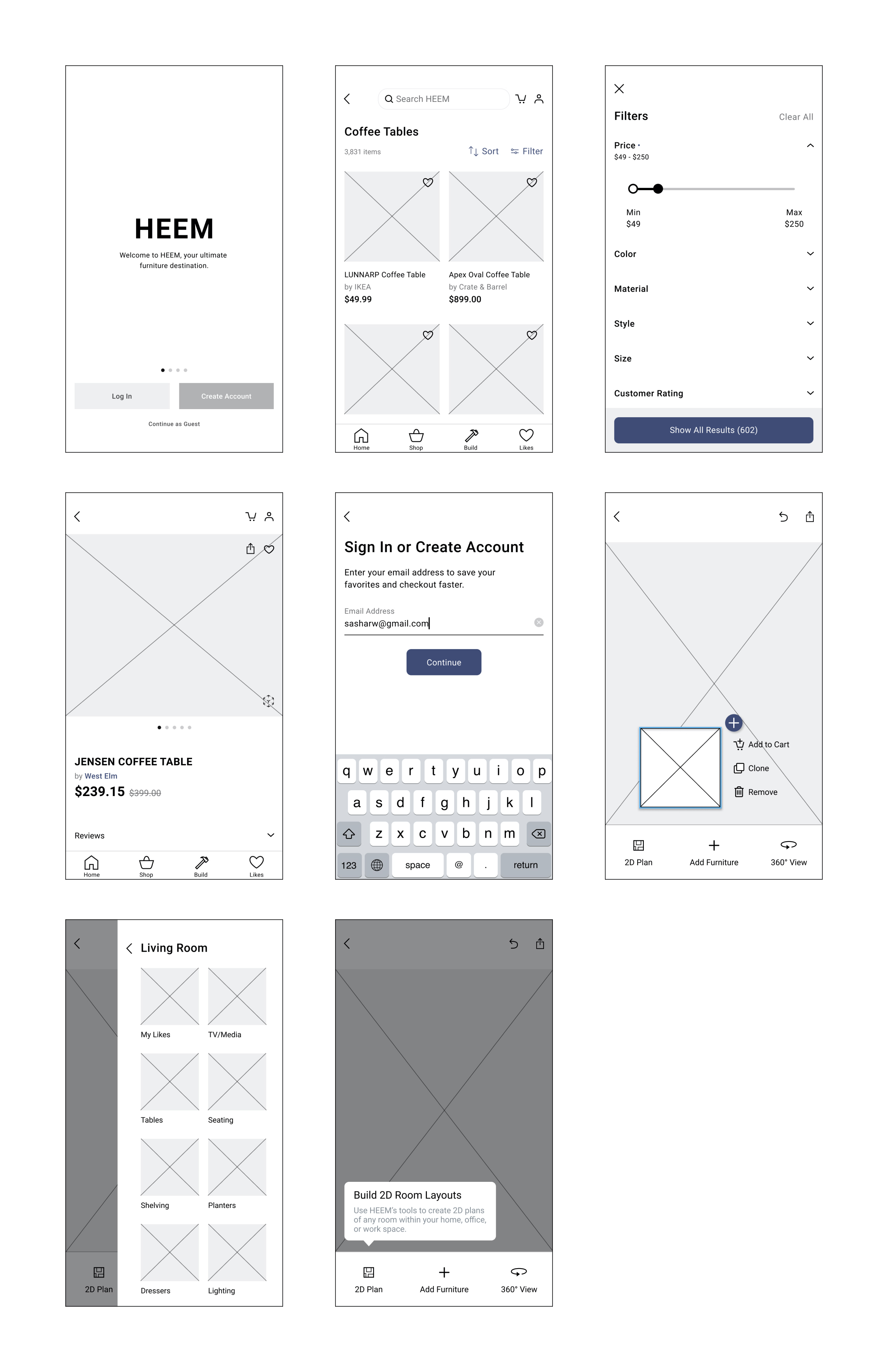
Mid Fidelity Wireframes (Prototype)
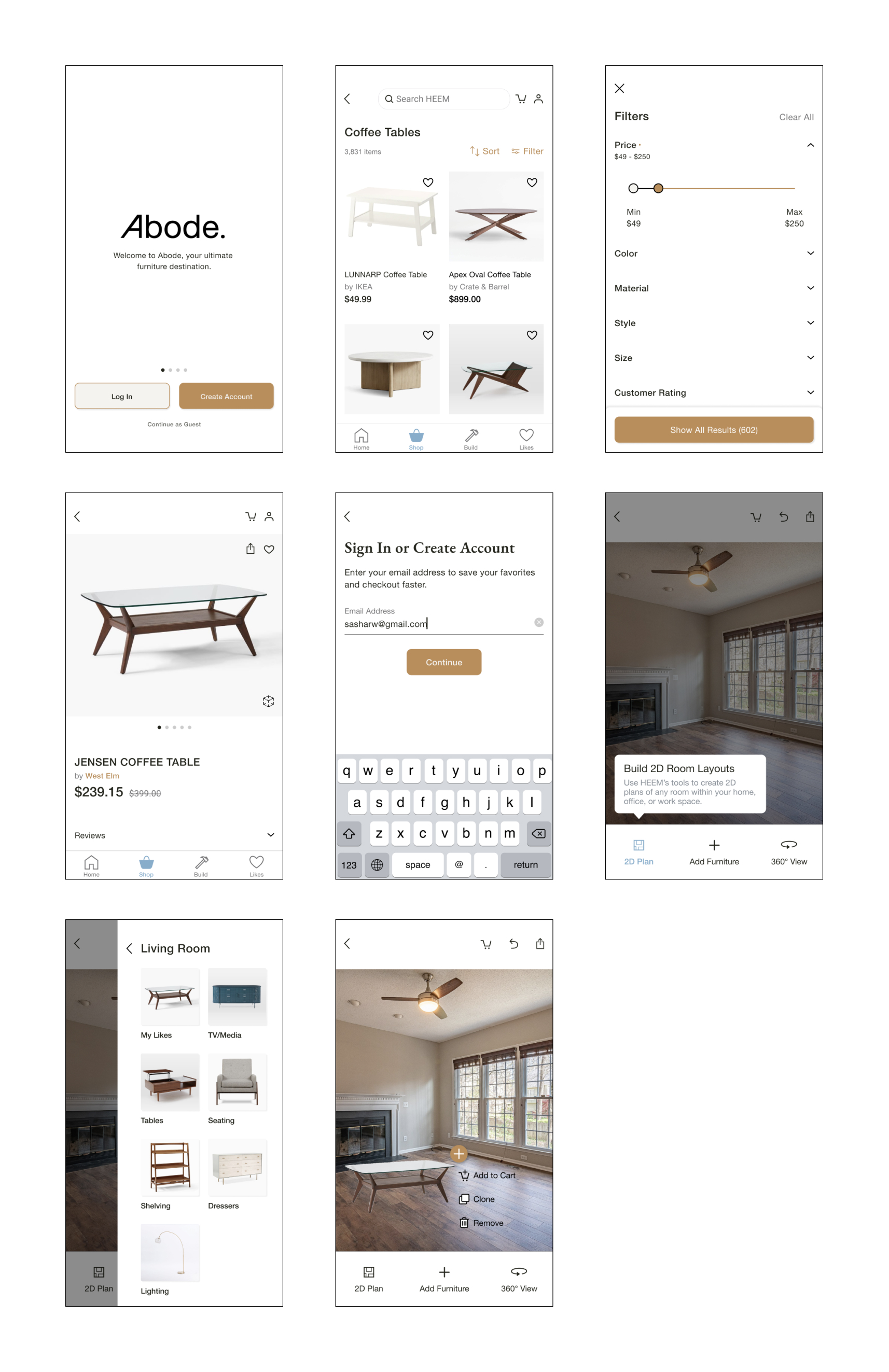
The first five screens are for scenario 1 and the last three screens are for scenario 2. To access the prototype, click here.
The first five screens are for scenario 1 and the last three screens are for scenario 2. To access the prototype, click here.
USABILITY TESTING PARTICIPANTS:
Similar to my research, I took observation notes during each testing session. I made sense of the all the data I collected from usability testing through the use of an affinity map.
- 7 female millennials
- Ages 24-32
Similar to my research, I took observation notes during each testing session. I made sense of the all the data I collected from usability testing through the use of an affinity map.
Affinity Map
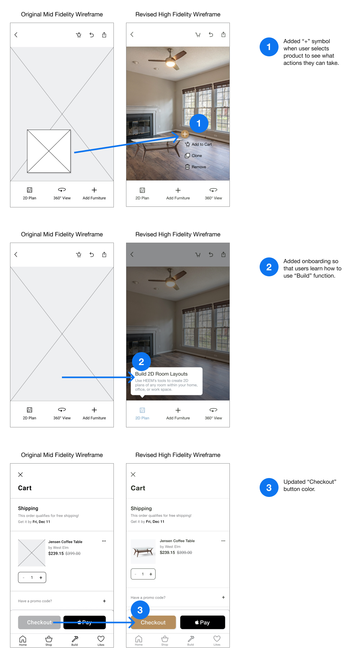
The insights from the affinity map helped me to create recommendations for updates to my prototype.
The insights from the affinity map helped me to create recommendations for updates to my prototype.

Insights:
1. Users are not completely familiar with how to use AR technologywithin apps
2. Users are best guided by color cues in the checkout process 3. When verbiage is not clear to users, they prefer guidance to help them take next steps
1. Users are not completely familiar with how to use AR technologywithin apps
2. Users are best guided by color cues in the checkout process 3. When verbiage is not clear to users, they prefer guidance to help them take next steps
Recommendations:
Priority 1 - Add a visual notification when users select AR furniture product
Priority 2 - Add onboarding for users when they’re using the “build” tool for the first time only
Priority 3 - Use a color that draws the users’ attention to “Checkout” as it competes with the bold, black Apple Pay CTA
Creating a visual identity
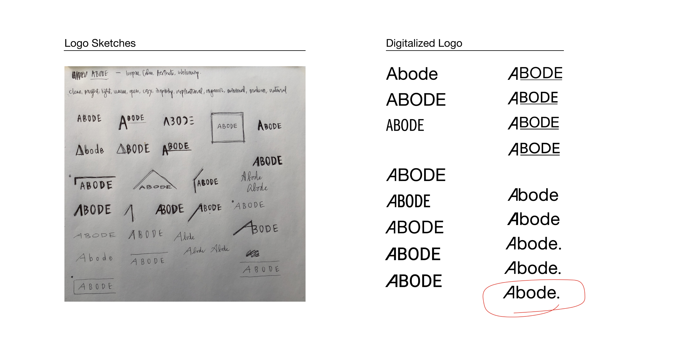
This is always one of my favorite parts - giving life to problems and solutions! As I started to think about the visual identity of Heem, I couldn’t help but think about the word “abode.” Heem has more of a Scandinavian, obscure and mysterious sound to it, but “abode” sounds cozy, welcoming and calming. I thought this was a better name suited for the app and its goals, so down that rabbit hole I went.
Brand Logo
Style Tile
The style tile is comprised of a bunch of visual elements for Abode like the logo, typography, colors, imagery, etc.
The style tile is comprised of a bunch of visual elements for Abode like the logo, typography, colors, imagery, etc.

Back to those affinity map recommendations...
As per the affinity map, I used the recommendations to update the mid fidelity prototype as well as create a high fidelity prototype.
Affinity Map Revisions
Putting this project to bed
CONCLUSION
We were able to find usage for the augmented reality technology for our users! Although AR already exists in several interior design and furniture apps, they mostly deal with placing only one item in one’s home. Our “build” feature allows users to add more than one item and to construct an unlimited number of rooms to mimic their entire homes. This ensures that items not only fit stylistically but also physically, so that we can minimize the number of and hassle with returns.
We were able to find usage for the augmented reality technology for our users! Although AR already exists in several interior design and furniture apps, they mostly deal with placing only one item in one’s home. Our “build” feature allows users to add more than one item and to construct an unlimited number of rooms to mimic their entire homes. This ensures that items not only fit stylistically but also physically, so that we can minimize the number of and hassle with returns.
NEXT STEPS
- Usability testing with high fidelity prototype and different tasks (the entire “build” process, including the other features like 2D plan)
- After synthesizing test findings, hand off prototype to developers
- Start with priority level 1 items from feature roadmap
